-1

I'm trying to create an overview that is spaced as the image that refers to my design. Currently I can't figure out how to make the items stay at the same spot when the length of the name variable will differ meaning the lay out is inconsistent.

What I am trying to remake What it currently looks like

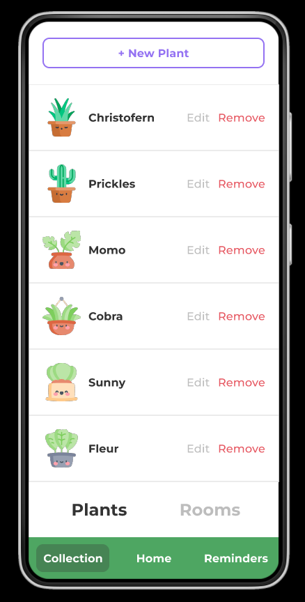
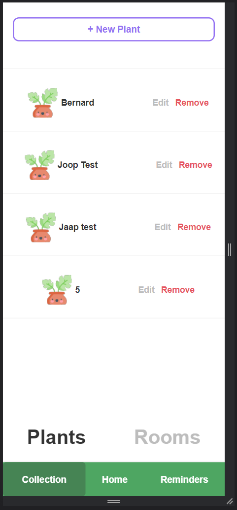
This is my current attempt, I've tried working with a table but I could not figure out how to do it that way. I'm hoping someone can help we with my CSS code to get my website to match my design.

HTML code responsible for the printing

#wrapper {
  border: 0px solid blue;
}

#Plant {
  display: inline-block;
  font-family: 'Montserrat', sans-serif;
  font-weight: bold;
  width: 60px;
  height: 60px;
}

#RoomNumber {
  display: inline-block;
  font-family: 'Montserrat', sans-serif;
  font-weight: bold;
  width: 20px;
  height: 20px;
  border: 1px solid rgb(88, 163, 104);
}

#Roomname {
  display: inline-block;
  font-family: 'Montserrat', sans-serif;
  font-weight: bold;
  width: 100;
  height: 20;
}

#Whitespace {
  display: inline-block;
  width: 80px;
}

#RoomEdit {
  display: inline-block;
  font-family: 'Montserrat', sans-serif;
  font-weight: bold;
  color: #bdbdbd;
  width: 40px;
}

#RoomRemove {
  display: inline-block;
  font-family: 'Montserrat', sans-serif;
  font-weight: bold;
  color: #e6555f;
  width: 50px;
}
{% for plants in plants %}
<div id="Plant">
  <a href="{{ url_for('Home', Room_id = plants.room_id, Plant_id = plants.id) }}"> <img src="{{ url_for('static',filename='src/TestPlant.png') }}" width="70" height="70"> </a>
</div>
<div id="Roomname"> {{ plants.name }} </div>
<div id="Whitespace"> </div>
<div id="RoomEdit"> Edit </div>
<div id="RoomRemove"> Remove </div>
<hr style=color:#bdbdbd;>
{% endfor %}
Pete
  • 57,112
  • 28
  • 117
  • 166
Teun
  • 11
  • 3

1 Answers1

0

I would wrap the row in a div and make it flex, then give sizes to all but the room name, which I would give flex-grow: 1

Below I have changed the following:

  • added row wrapper (align-items vertically centres the text)
  • added the border to the row and removed the hr (optional)
  • removed heights
  • removed whitespace div and used margin instead
  • changed ids to classes
  • removed width and height from img tag and given it 100% width (it seemed to be larger than the div it was in)

.row {
  display: flex;
  align-items: center;
  border-bottom: 1px solid #bdbdbd;
  font-family: 'Montserrat', sans-serif;
  font-weight: bold;
}

.Plant {
  width: 60px;
  height: 60px;
}

.Plant img {
  display: block;
  width: 100%;
}

.RoomNumber {
  width: 20px;
  border: 1px solid rgb(88, 163, 104);
}

.Roomname {
  flex-grow: 1;
  margin-right: 80px;
}

.RoomEdit {
  color: #bdbdbd;
  width: 40px;
}

.RoomRemove {
  color: #e6555f;
  width: 50px;
}
<div class="row">
  <div class="Plant">
    <a href="{{ url_for('Home', Room_id = plants.room_id, Plant_id = plants.id) }}"> <img src="{{ url_for('static',filename='src/TestPlant.png') }}"> </a>
  </div>
  <div class="Roomname"> {{ plants.name }} </div>
  <div class="RoomEdit"> Edit </div>
  <div class="RoomRemove"> Remove </div>
</div>
Pete
  • 57,112
  • 28
  • 117
  • 166
  • This fixed my styling and works great, but it made my 2 rows, Plant and Rooms and Home, Collection and Reminders get way lower in the page to the point where I needed to scroll while they should be constantly on the bottom of the screen. Do you have any idea what could have caused this? https://imgur.com/a/HWXt9EC shows what is currently happening https://imgur.com/a/zw49rdE shows how the scrolling combined with the bar works on other pages – Teun Nov 24 '22 at 17:36
  • Hi this seems to be a different question to the one asked above. Please ask a new question creating a [mcve] to demonstrate the issue – Pete Nov 25 '22 at 09:12
  • I just uploaded a question regarding the issue. If you have time it would be nice if you could take a look at it. Thanks in advance – Teun Dec 09 '22 at 15:12