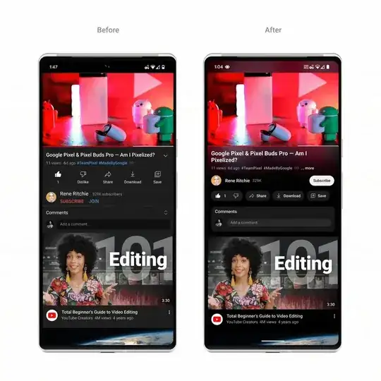
In the latest Youtube update, Google has put a glow effect behind the videos. He calls it "cinematicmode" which takes the video in question and creates that beam of light while the video is playing. I'm with a Boostrap5 project trying to replicate the same format that youtube has but I don't know how to do it. I don't know if it can be done with JS or with CSS or with some external library.
The code I am working on:
.container {
max-width: 980px;
}
.title {
color: white;
}
.bd-placeholder-img {
font-size: 1.125rem;
text-anchor: middle;
-webkit-user-select: none;
-moz-user-select: none;
user-select: none;
}
.b-example-divider {
height: 3rem;
background-color: rgba(0, 0, 0, 0.1);
border: solid rgba(0, 0, 0, 0.15);
border-width: 1px 0;
box-shadow: inset 0 0.5em 1.5em rgba(0, 0, 0, 0.1),
inset 0 0.125em 0.5em rgba(0, 0, 0, 0.15);
}
.b-example-vr {
flex-shrink: 0;
width: 1.5rem;
height: 100vh;
}
.bi {
vertical-align: -0.125em;
fill: currentColor;
}
.nav-scroller {
position: relative;
z-index: 2;
height: 2.75rem;
overflow-y: hidden;
}
.nav-scroller .nav {
display: flex;
flex-wrap: nowrap;
padding-bottom: 1rem;
margin-top: -1px;
overflow-x: auto;
text-align: center;
white-space: nowrap;
-webkit-overflow-scrolling: touch;
}
video {
border-radius: 5%;
width: 100%;
}
.video-tam {
width: 220px;
height: 140px;
}
.tit {
border-radius: 10px;
}
.tit-video {
font-size: 20px;
margin-top: 2%;
}
.descrip {
color: white;
}
.img-logo {
width: 30vh;
}
.img-user{
width: 10vh;
}
.cont-descrip {
margin-top: 5%;
background-color: #dc3444;
border-radius: 10px;
padding: 2%;
}
@media (min-width: 768px) {
.bd-placeholder-img-lg {
font-size: 3.5rem;
}
}
body{
background: #304FFE;
}
.form-control:focus {
color: #495057;
background-color: #fff;
border-color: #80bdff;
outline: 0;
box-shadow: none !important;
}
.dashboard-header .navbar {
padding: 0px;
border-bottom: 1px solid #e6e6f2;
-webkit-box-shadow: 0px 0px 28px 0px rgba(82, 63, 105, 0.13);
box-shadow: 0px 0px 28px 0px rgba(82, 63, 105, 0.13);
-webkit-transition: all 0.3s ease;
min-height: 60px;
}
.navbar-brand {
display: inline-block;
margin-right: 1rem;
line-height: inherit;
white-space: nowrap;
padding: 11px 20px;
font-size: 30px;
text-transform: uppercase;
font-weight: 700;
color: #007bff;
}
.navbar-brand:hover{
color: #007bff;
}
.navbar-right-top {}
.navbar-right-top .nav-item {
border-right: 1px solid #e6e6f2;
}
.navbar-right-top .nav-item:last-child {
border: none;
}
.navbar-right-top .nav-item .nav-link {
padding: 13px 20px;
font-size: 16px;
line-height: 2;
color: #82849f;
}
/* -- top-search-bar --- */
.top-search-bar {
padding-top: 12px;
padding-right: 24px;
}
/* ------ Notification Dropdown -------- */
.notification {}
.notification-dropdown {
min-width: 320px;
}
.notification-dropdown,
.connection-dropdown,
.nav-user-dropdown {
padding: 0px;
margin: 0px;
}
.notification-title {
font-size: 14px;
color: #3d405c;
text-align: center;
padding: 8px 0px;
border-bottom: 1px solid #e3e3e3;
line-height: 1.5;
background-color: #fffffe;
}
.notification-list {}
.notification-list .list-group-item {
border-radius: 0px;
padding: 12px;
margin-top: -1px;
border-left: transparent;
border-right: transparent;
}
.notification-list .list-group-item.active {
z-index: 2;
color: #3d405c;
background-color: #f7f7fb;
border-color: #e1e1e7;
}
.notification-list .list-group-item-action:focus,
.list-group-item-action:hover {
color: #404040;
text-decoration: none;
background-color: #f7f7fb;
}
.notification-list .list-group-item:last-child {}
.notification-info {}
.notification-info .notification-date {
display: block;
font-size: 11px;
margin-top: 4px;
text-transform: uppercase;
color: #71748d;
}
.notification .dropdown-toggle::after,
.connection .dropdown-toggle::after,
.nav-user .dropdown-toggle::after {
display: inline-block;
width: 0;
height: 0;
margin-left: .255em;
vertical-align: .255em;
content: "";
border: none;
}
.notification-list-user-img {
float: left;
}
.notification-list-user-block {
padding-left: 50px;
font-size: 14px;
line-height: 21px;
}
.notification-list-user-name {
color: #5969ff;
font-size: 14px;
margin-right: 8px;
}
.list-footer,
.conntection-footer {
font-size: 14px;
color: #fff;
text-align: center;
padding: 10px 0px;
line-height: 1.5;
font-weight: 700;
background-color: #5969ff;
border-bottom-left-radius: 3px;
border-bottom-right-radius: 3px;
}
.list-footer a,
.conntection-footer a {
color: #fff;
}
.list-footer a:hover,
.conntection-footer a:hover {
color: #fff;
}
.indicator {
content: '';
position: absolute;
top: 16px;
right: 23px;
display: inline-block;
width: 7px;
height: 7px;
border-radius: 100%;
background-color: #ef172c;
animation: .9s infinite beatHeart;
transform-origin: center;
}
@keyframes beatHeart {
0% {
transform: scale(0.9);
}
25% {
transform: scale(1.1);
}
40% {
transform: scale(0.9);
}
60% {
transform: scale(1.1);
}
100% {
transform: scale(0.9);
}
}
/* ------ Connection -------- */
.connection {}
.connection-dropdown {}
.connection-list {
width: 300px;
padding: 20px;
}
.connection-item {
border-radius: 3px;
line-height: 32px;
text-align: center;
padding: 12px 7px 4px;
display: block;
border: 1px solid transparent;
color: #3d405c;
font-size: 12px;
}
.connection-item img {
width: 32px;
}
.connection-item:hover {
background-color: #fff;
border: 1px solid #e6e6f2;
}
.connection-item span {
display: block;
overflow: hidden;
text-overflow: ellipsis;
white-space: nowrap;
}
/* ----- User Nav Dropdown -----*/
.nav-user {}
.nav-user-dropdown {
padding: 0px;
min-width: 230px;
margin: 0px;
}
.nav-user-name {}
.nav-user-info {
background-color: #5969ff;
line-height: 1.4;
padding: 12px;
color: #fff;
font-size: 13px;
border-radius: 2px 2px 0 0;
}
.nav-user-info .status {
float: left;
top: 7px;
left: 0px;
}
.nav-user-dropdown {}
.nav-user-dropdown .dropdown-item {
display: block;
width: 100%;
padding: 12px 22px 15px;
clear: both;
font-weight: 400;
color: #686972;
text-align: inherit;
white-space: nowrap;
background-color: transparent;
border: 0;
font-size: 13px;
line-height: 0.4;
}
.nav-user-dropdown .dropdown-item:hover {
background-color: #f7f7fb;
}
/*---- User icon sizes ---*/
.user-avatar-xxl {
height: 128px;
width: 128px;
}
.user-avatar-xl {
height: 90px;
width: 90px;
}
.user-avatar-lg {
height: 48px;
width: 48px;
}
.user-avatar-md {
height: 32px;
width: 32px;
}
.user-avatar-sm {
height: 24px;
width: 24px;
}
.user-avatar-xs {
height: 18px;
width: 18px;
}
.avatar {
width: 2.25rem;
height: 2.25rem;
border-radius: 50%;
border: 2px solid #F7F9FA;
background: #F7F9FA;
color: #fff;
}
.media-attachment div.avatar {
border: none;
}
.avatar.bg-primary {
display: flex;
align-items: center;
justify-content: center;
}
.avatar.bg-primary i {
font-size: 14px;
}
<!DOCTYPE html>
<html lang="es">
<head>
<meta charset="utf-8" />
<meta name="viewport" content="width=device-width, initial-scale=1" />
<meta name="description" content="" />
<meta
name="author"
content="Mark Otto, Jacob Thornton, and Bootstrap contributors"
/>
<meta name="viewport" content="width=device-width, initial-scale=1" />
<link
href="https://cdn.jsdelivr.net/npm/bootstrap@5.2.2/dist/css/bootstrap.min.css"
rel="stylesheet"
integrity="sha384-Zenh87qX5JnK2Jl0vWa8Ck2rdkQ2Bzep5IDxbcnCeuOxjzrPF/et3URy9Bv1WTRi"
crossorigin="anonymous"
/>
<title>YouFlix</title>
<meta name="generator" content="Hugo 0.104.2" />
<link
rel="canonical"
href="https://getbootstrap.com/docs/5.2/examples/checkout/"
/>
<link href="../assets/dist/css/bootstrap.min.css" rel="stylesheet" />
<link rel="stylesheet" href="main.css" />
</head>
<body class="bg-dark">
<div class="container">
<main>
<div class="py-5 text-center">
<img
class="d-block mx-auto mb-4 img-logo"
src="Logo_negro_negro.webp"
alt="YouFlix"
/>
<h2 class="title">YouFlix</h2>
<p class="lead text-light">Tu Web de Videos preferida</p>
</div>
<div class="row g-5">
<div class="col-md-7 col-lg-8">
<video class="embed-responsive embed-responsive-16by9" controls>
<source src="videoplayback.mp4" type="video/mp4" />
</video>
<span
class="tit-video badge bg-danger rounded-pill w-100 text-start"
>TITULO DEL VIDEO</span
>
<div class="cont-descrip">
<p class="descrip">
Lorem ipsum dolor sit amet consectetur adipisicing elit. Ea,
est? Error, enim. Esse, provident vitae aliquam, illum
distinctio est quis quidem minus quisquam ullam quos, nisi neque
necessitatibus voluptas dolorem.
</p>
</div>
</div>
<div class="col-md-5 col-lg-4 order-md-last">
<h4 class="d-flex justify-content-between align-items-center mb-3">
<span class="badge bg-danger rounded-pill">TUS VIDEOS</span>
<span class="badge bg-danger rounded-pill">100</span>
</h4>
<ul class="list-group mb-5">
<li
class="list-group-item d-flex justify-content-between lh-sm bg-secondary"
>
<div>
<video
class="embed-responsive embed-responsive-16by9 video-tam"
controls
>
<source src="videoplayback.mp4" type="video/mp4" />
</video>
<span class="text-light">12:04</span>
</div>
</li>
<li
class="list-group-item d-flex justify-content-between lh-sm bg-secondary"
>
<div>
<video
class="embed-responsive embed-responsive-16by9 video-tam"
controls
>
<source src="videoplayback.mp4" type="video/mp4" />
</video>
<span class="text-light">12:04</span>
</div>
</li>
<li
class="list-group-item d-flex justify-content-between lh-sm bg-secondary"
>
<div>
<video
class="embed-responsive embed-responsive-16by9 video-tam"
controls
>
<source src="videoplayback.mp4" type="video/mp4" />
</video>
<span class="text-light">12:04</span>
</div>
</li>
<li
class="list-group-item d-flex justify-content-between lh-sm bg-secondary"
>
<div>
<video
class="embed-responsive embed-responsive-16by9 video-tam"
controls
>
<source src="videoplayback.mp4" type="video/mp4" />
</video>
<span class="text-light m-2">12:04</span>
</div>
</li>
</ul>
</div>
</div>
</main>
<footer class="my-5 pt-5 text-muted text-center text-small">
<p class="mb-1">© 2022–2023 YouFlix</p>
</footer>
</div>
<script src="../assets/dist/js/bootstrap.bundle.min.js"></script>
<script src="form-validation.js"></script>
</body>
</html>

I have not found any of the web format. Someone could help me? Thanks in advance. :)
I tried to use backdrop-filter in CSS but does not fit with my description