Consider the following grouped violin plot with split violins
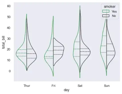
which is generated by this code snippet
import seaborn as sns
sns.set_theme(style="whitegrid")

# Load the example tips dataset
tips = sns.load_dataset("tips")

# Draw a nested violinplot and split the violins for easier comparison
sns.violinplot(data=tips, x="day", y="total_bill", hue="smoker",
           split=True, inner="quart", linewidth=1,
           palette={"Yes": "b", "No": ".85"})
sns.despine(left=True)
(Code and figure are extracted from http://seaborn.pydata.org/examples/grouped_violinplots.html)
For illustration purposes, I would like to insert some space between the blue and grey violin-halfs.