How do I separate text and icon in TextButton to make it like whatsapp settings
Row(
    modifier = Modifier
        .fillMaxWidth()
        .height(50.dp)
) {
    TextButton(
        onClick = { /*TODO*/  },
        modifier = Modifier.fillMaxSize(),
    ) {

        Text(text = "$name")
        Icon(
            imageVector = Icons.Filled.KeyboardArrowRight,
            contentDescription = "",
            modifier = Modifier.size(40.dp)
        )
    }
}
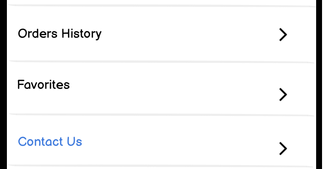
It shows
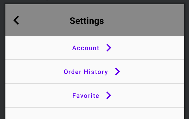
But I want to like this
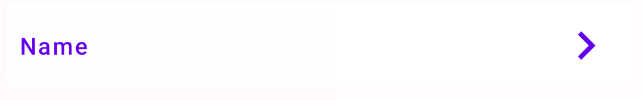
I try Spacer and Padding but it didn't work because I have
fun SettingsButtons(name: String)
@Composable
fun SettingsButtons(name: String) {

    Row(
        modifier = Modifier
            .fillMaxWidth()
            .height(50.dp)
    ) {
        TextButton(
            onClick = { /*TODO*/ },
            modifier = Modifier.fillMaxSize(),
        ) {

            Text(text = "$name")
            Icon(
                imageVector = Icons.Filled.KeyboardArrowRight,
                contentDescription = "",
                modifier = Modifier.size(40.dp)
            )
        }
    }

}
And based on the parameter that I passed {name} the text will be changed
SettingsButtons(name = "Account")
SettingsButtons(name = "Order History")
SettingsButtons(name = "Favorite")
so I think that why Spacer and Padding didn't work because the text size is different or I am not using it correctly