I am handling a slightly large set of data (dimensions 360,25,3): dimensions correspond to (event_severity,zone,model) respectively. I also have a similar dataframe for another time window
I imagine my data to be organized into three stacked matrices (one per model), with each column containing all the event_severities.
I need to perform two operations on the above matrix:
remove all events whose event_severity = 0 The tricky part here is that every zone (column) has a different number of 0's, so removing them results in columns of different length. I don't know if this can be an issue for the rest of my task, but i wold like to know how to work around this
plot a grouped boxplot of the severities for each zone (25 different plots) grouping them by model and comparing the two different time windows
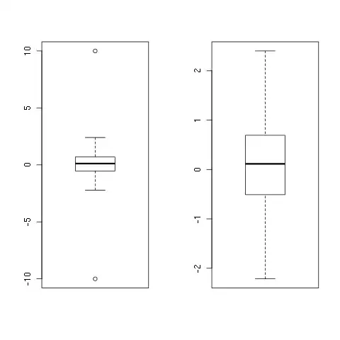
The final result I am expecting looks more or less like this:
The variables to be box-plotted are the event_severities (i am computing their statistics). I would like to have a plot comparing the severities of a given zone, for three different models, between two separate time windows
Note #1: browsing through R-boxplot guides on the internet, i thought putting my data in a dataframe could help. However, by using as.data.frame on my (360,25,3) array transforms it into a 360 observation-75 variables dataframe, which i have a hard time interpreting.
Note#2: if you could walk me through the plotting instruction that would be greatly appreciated
