6

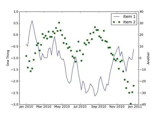
I'm trying to graph two types of plots in the same window (i.e. a line plot, and a scatter plot). The data being plotted in the line graph (first plot) are floating numerical values representing climate indices (Y) vs. decimal years (X). The second plot that I would like to be a 'scatter'ed is much the same, but with floating numerical values representing stream flows (Y) vs. decimal years (X). I've tried to accomplish this as follows by using a twin x axis and a second, parasite y axis for the scatter plot:

    import mpl_toolkits
    from mpl_toolkits.axes_grid1 import host_subplot
    import matplotlib.pyplot as plt

    host = host_subplot(111)
    par = host.twinx()

    host.set_xlim(1880, 2020)
    host.set_ylim(-5, 10)

    host.set_xlabel("Time")
    host.set_ylabel("PDSI Region 01")
    par.set_ylabel("Minimum 10% Annual 7-day Non-exceedance Flow (cfs)")

    x1 = timearray
    y1 = pdsiarray01
    x2 = upAmm_yr
    y2 = upAmm_min

    p1, = host.plot(x1, y1, label="PDSI01")
    p2, = par.scatter(x2, y2, label="Annual Lowflow Upper Amm")

    par.set_ylim(30, 60)

    host.legend()
    host.axis["left"].label.set_color(p1.get_color())
    par.axis["right"].label.set_color(p2.get_color())

    plt.draw()
    plt.show()

and I get the error code:

    TypeError: cannot perform reduce with flexible type

This code works fine when I replace scatter with plot in the line that starts with p2, but produces a second line plot. The ultimate reason I want it scattered is that there are many fewer points to be plotted in the second dataset, and the lines connecting them are distracting and 'messy' (when I all need is to highlight an instant in time). A bar plot instead of a scatter would work too. Any suggestions or help would be much appreciated!

hdevs
  • 63
  • 1
  • 1
  • 4
  • Related: http://stackoverflow.com/questions/1746312/why-wont-my-python-scatter-plot-work Try to make sure that both your arrays have the correct data type. Did you try casting the elements of your y2 array into float? – Urjit Sep 08 '11 at 19:17
  • If you're just wanting circular markers for a plot, don't use `scatter`, just use `plot` and specify circular markers with no lines connecting them. (e.g. `par.plot(x2, y2, 'o')` or more verbosely `par.plot(x2, y2, linestyle='none', marker='o')`. Scatter is intended to vary colors and/or sizes of the markers based on a 3rd and 4th variable. It returns a collection with is different (and more flexible) than the `Line2D` artist that `plot` returns. There's no reason to use scatter unless you need to vary colors or sizes based on another variable. – Joe Kington Sep 08 '11 at 19:26

2 Answers2

6

Why not just use plot in both cases?

import datetime
import numpy as np
import matplotlib.pyplot as plt
import matplotlib.dates as mdates

# Generate some random data
time = mdates.drange(datetime.datetime(2010, 1, 1), 
                     datetime.datetime(2011, 1, 1),
                     datetime.timedelta(days=5))
y1 = np.cumsum(np.random.random(time.size) - 0.5)
y2 = np.cumsum(np.random.random(time.size) - 0.5)
y2 = y2 * 20 + 10

# Plot things up...
fig = plt.figure()
host = fig.add_subplot(111)
par = host.twinx()

host.set_ylabel('One Thing')
par.set_ylabel('Another')

line1, = host.plot(time, y1)
line2, = par.plot(time, y2, 'go')
host.legend([line1, line2], ['Item 1', 'Item 2'])

host.xaxis_date()

plt.show()

enter image description here

Joe Kington
  • 275,208
  • 71
  • 604
  • 463
1

fI can't reproduce your exact error, but I don't think you need the comma after p2 as scatter only returns a single value. When that is changed, your code works for me except that p2 is a CircleCollection that has no get_color method. You'll need to change that to p2.get_facecolor() or something else.

Stephen Terry
  • 6,169
  • 1
  • 28
  • 31