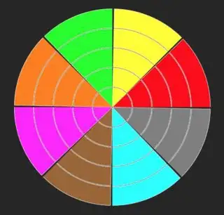
how to structure the dataframe so it can be used for hierarchical pie/donut charts
This is an ideal case for a hierarchical MultiIndex:
Use df.value_counts to generate counts in a MultiIndex (one feature per level):
counts = df.value_counts() # long output shown at bottom of post
Then the wedge values can simply be computed with groupby.sum, e.g. for level 2:
counts.groupby(level=[0, 1, 2]).sum() # long output shown at bottom of post
The matplotlib nested donut demo uses the same concept with numpy arrays (one feature per matrix dimension), but that gets too unwieldy for higher dimensions. It's much simpler to structure the counts as an n-level MultiIndex than n-dimensional array.
how to adapt the documentation to said dataframe
Update: The code now colorizes the wedges based on the root node:

Full code to transform a raw DataFrame -> nested donuts (with a more manageable sample for demonstration):
import pandas as pd
import numpy as np
import matplotlib.pyplot as plt

WEDGE_SIZE = 0.5
LABEL_THRESHOLD = 1

df = pd.DataFrame({'one': list('AAAAAAAAABBBBBBBCCCC'), 'two': list('DDDDDDEEEFFFGGGGHHII'), 'three': list('JJJKKLLMMMMNNNNNNNNN'), 'four': list('OOPPPPQQRSTTTUUUUVVV'), 'five': list('WWWXXXXXXYYYYYYZZZZZ')}).cumsum(1)

fig, ax = plt.subplots()

# generate MultiIndex of counts with one feature per level
counts = df.value_counts()

# define primary colormaps (cycle if levels > 6)
cmaps = np.resize(['Blues_r', 'Greens_r', 'Oranges_r', 'Purples_r', 'Reds_r', 'Greys_r'],
                  counts.index.get_level_values(0).size)

for level in range(len(counts.index.names)):
    # compute grouped sums up to current level
    wedges = counts.groupby(level=list(range(level+1))).sum()

    # extract annotation labels from MultiIndex
    labels = wedges.index.get_level_values(level)

    # generate color shades per group
    index = [(i,) if level == 0 else i for i in wedges.index.tolist()] # standardize Index vs MultiIndex
    g0 = pd.DataFrame.from_records(index).groupby(0)
    maps = g0.ngroup()
    shades = g0.cumcount() / g0.size().max()
    colors = [plt.get_cmap(cmaps[m])(s) for m, s in zip(maps, shades)]

    # plot colorized/labeled donut layer
    ax.pie(x=wedges,
           radius=1 + (level * WEDGE_SIZE),
           colors=colors,
           labels=np.where(wedges >= LABEL_THRESHOLD, labels, ''), # unlabel if under threshold
           rotatelabels=True,
           labeldistance=1.1 - 1.4/(level+3.5), # put labels inside wedge instead of outside (requires manual tweaking)
           wedgeprops=dict(width=WEDGE_SIZE, linewidth=0, alpha=0.33))
Note that your sample data maps to a huge number of wedges (outer level = 199 species), so aggregating smaller values as "other" won't really work. The wedges are all basically the same small size, so I'm not sure how this full sample could be reasonably labeled.
Full sample on the left, smaller subset on the right:


For reference, these are the outputs from df -> df.value_counts -> groupby.sum.
Original df:
>>> df = pd.DataFrame({'one': list('AAAAAAAAABBBBBBBCCCC'), 'two': list('DDDDDDEEEFFFGGGGHHII'), 'three': list('JJJKKLLMMMMNNNNNNNNN'), 'four': list('OOPPPPQQRSTTTUUUUVVV'), 'five': list('WWWXXXXXXYYYYYYZZZZZ')}).cumsum(1)
>>> df

   one two three  four   five
0    A  AD   ADJ  ADJO  ADJOW
1    A  AD   ADJ  ADJO  ADJOW
2    A  AD   ADJ  ADJP  ADJPW
3    A  AD   ADK  ADKP  ADKPX
4    A  AD   ADK  ADKP  ADKPX
5    A  AD   ADL  ADLP  ADLPX
6    A  AE   AEL  AELQ  AELQX
7    A  AE   AEM  AEMQ  AEMQX
8    A  AE   AEM  AEMR  AEMRX
9    B  BF   BFM  BFMS  BFMSY
10   B  BF   BFM  BFMT  BFMTY
11   B  BF   BFN  BFNT  BFNTY
12   B  BG   BGN  BGNT  BGNTY
13   B  BG   BGN  BGNU  BGNUY
14   B  BG   BGN  BGNU  BGNUY
15   B  BG   BGN  BGNU  BGNUZ
16   C  CH   CHN  CHNU  CHNUZ
17   C  CH   CHN  CHNV  CHNVZ
18   C  CI   CIN  CINV  CINVZ
19   C  CI   CIN  CINV  CINVZ
MultiIndex from df.value_counts:
>>> counts = df.value_counts()
>>> counts

one  two  three  four  five
A    AD   ADJ    ADJO  ADJOW    2
          ADK    ADKP  ADKPX    2
B    BG   BGN    BGNU  BGNUY    2
C    CI   CIN    CINV  CINVZ    2
A    AD   ADJ    ADJP  ADJPW    1
          ADL    ADLP  ADLPX    1
     AE   AEL    AELQ  AELQX    1
          AEM    AEMQ  AEMQX    1
                 AEMR  AEMRX    1
B    BF   BFM    BFMS  BFMSY    1
                 BFMT  BFMTY    1
          BFN    BFNT  BFNTY    1
     BG   BGN    BGNT  BGNTY    1
                 BGNU  BGNUZ    1
C    CH   CHN    CHNU  CHNUZ    1
                 CHNV  CHNVZ    1
Wedge totals from groupby.sum:
>>> counts.groupby(level=[0]).sum()

one
A    9
B    7
C    4
>>> counts.groupby(level=[0, 1]).sum()

one  two
A    AD     6
     AE     3
B    BF     3
     BG     4
C    CH     2
     CI     2
>>> counts.groupby(level=[0, 1, 2]).sum()

one  two  three
A    AD   ADJ      3
          ADK      2
          ADL      1
     AE   AEL      1
          AEM      2
B    BF   BFM      2
          BFN      1
     BG   BGN      4
C    CH   CHN      2
     CI   CIN      2
>>> counts.groupby(level=[0, 1, 2, 3]).sum()

one  two  three  four
A    AD   ADJ    ADJO    2
                 ADJP    1
          ADK    ADKP    2
          ADL    ADLP    1
     AE   AEL    AELQ    1
          AEM    AEMQ    1
                 AEMR    1
B    BF   BFM    BFMS    1
                 BFMT    1
          BFN    BFNT    1
     BG   BGN    BGNT    1
                 BGNU    3
C    CH   CHN    CHNU    1
                 CHNV    1
     CI   CIN    CINV    2


