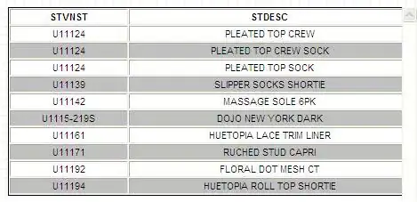
I have some data coming from a SQL Server query and the table looks as shown in the next figure:
If I display this in an Excel chart, it looks like the following picture:

As it can be noticed, in Excel the chart displays the data according to the order they have in the table.
When I tried to show this data in a Power BI line chart, it looks like the following picture:

Because the data is sorted by the occupancy values.
I do not want the data sorted as Power BI does. I want the data in the same way they are in the table. Any ideas about how can I do to disable the sorting axis option?


