I am running a macOS application that contains a Form with some elements on it. I love the default layout when using elements with labels (example: TextField and Picker) but am having trouble replicating that layout with a custom control. Specifically I want to have an HStack containing a Text/Label field (laid out under the other labels) and a button (even with the other fields above). Instead both elements are under the second part and not both.
I created a dummy project showing my issue. It's like the Form is a two column table and the labels are getting put in the first column and anything else goes in the second column. I did see this question, Swiftui Form Label alignment on macOS, but I was hoping with my below example there might be a better solution. I tried putting everything in a VStack but then the labels are left aligned and the text boxes start wherever. I also don't want to hardcode the width of the labels.
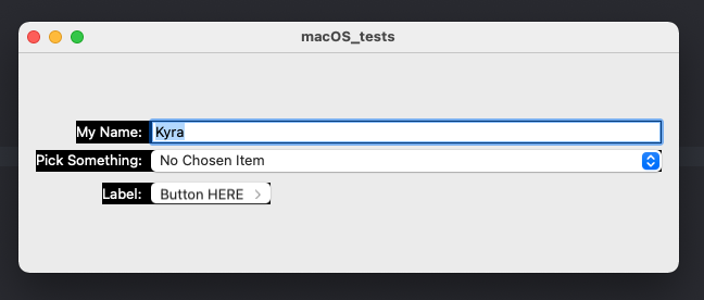
This is what I made as an example:
 With the code:
import SwiftUI

struct ContentView: View {

@State var myName:String = "Kyra"
@State var selectedPickerItem: String?
var pickerItems = ["item 1",
                   "item 2",
                   "item 3",
                   "item 4",
                   "item 5",
                   "item 6"]

var body: some View {
    Form {

        TextField("My Name:", text: $myName, prompt: Text("What's your name?"))
            .foregroundColor(.white)
            .background(.black)

        Picker(selection: $selectedPickerItem, label: Text("Pick Something:")) {
            Text("No Chosen Item").tag(nil as String?)
            ForEach(pickerItems, id: \.self) { item in
                Text(item).tag(item as String?)
            }
        }
        .foregroundColor(.white)
        .background(.black)

        HStack {
            Label("Label:", image: "default")
                .labelStyle(.titleOnly)
                .foregroundColor(.white)

            Button(action: {
                print("Do something")
            }) {
                HStack {
                    Text("Button HERE")
                    Image(systemName: "chevron.right")
                        .foregroundColor(.secondary)
                        .font(.caption)
                }
            }
        }
        .frame(minWidth: 0, maxWidth: .infinity)
        .background(.black)
    }
    .padding()
}
}
I basically want the third section in the form to look like the previous two. I added a black background so it's more apparent. I want the label: to be even under My Name: and Pick Something: while the button is even with the text field itself and the picker above.
Thanks to anyone that can help me come up with an elegant solution
Update 1: Took @ChrisR's comment and attempted to use the style. I found that the ButtonStyle doesn't have a width like the ToggleStyle example. I then found this question, Get width of a view using in SwiftUI, and used the commonSize in Paul B's answer to set the alignment. It's set the width of my stack properly but can't set the alignment properly.
Image: 
Code:
import SwiftUI

struct ContentView: View {

@State var myName:String = "Kyra"
@State var selectedPickerItem: String?
var pickerItems = ["item 1",
                   "item 2",
                   "item 3",
                   "item 4",
                   "item 5",
                   "item 6"]
@State private var commonSize = CGSize()

var body: some View {
    Form {

        TextField("My Name:", text: $myName, prompt: Text("What's your name?"))
            .foregroundColor(.white)
            .background(.black)
            .readSize { textSize in
                commonSize = textSize
            }

        Picker(selection: $selectedPickerItem, label: Text("Pick Something:")) {
            Text("No Chosen Item").tag(nil as String?)
            ForEach(pickerItems, id: \.self) { item in
                Text(item).tag(item as String?)
            }
        }
        .foregroundColor(.white)
        .background(.black)

        HStack {
            Label("Label:", image: "default")
                .labelStyle(.titleOnly)
                .foregroundColor(.white)

            Button(action: {
                print("Do something")
            }) {
                HStack {
                    Text("Button HERE")
                    Image(systemName: "chevron.right")
                        .foregroundColor(.secondary)
                        .font(.caption)
                }
            }
        }
        .frame(width: commonSize.width, height: commonSize.height)
        .alignmentGuide(.leading, computeValue: { d in (d.width - commonSize.width) })
        .background(.black)
    }
    .padding()
}
}

  func readSize(onChange: @escaping (CGSize) -> Void) -> some View     {
    background(
      GeometryReader { geometryProxy in
        Color.clear
          .preference(key: SizePreferenceKey.self, value: geometryProxy.size)
      }
    )
    .onPreferenceChange(SizePreferenceKey.self, perform: onChange)
  }
}

private struct SizePreferenceKey: PreferenceKey {
  static var defaultValue: CGSize = .zero
  static func reduce(value: inout CGSize, nextValue: () -> CGSize)     {}
}
Update 2: I attempted ChrisP's answer "You want .readSize from your Button label, and get rid of the .frame" and ended up with both left aligned in the right column:

If I don't set commonSize or use 0 instead it moves both elements to the first column:

If I split up the elements by removing the label from the HStack I can get one on the first column and one on the second BUT then they're on two different lines.
