-1

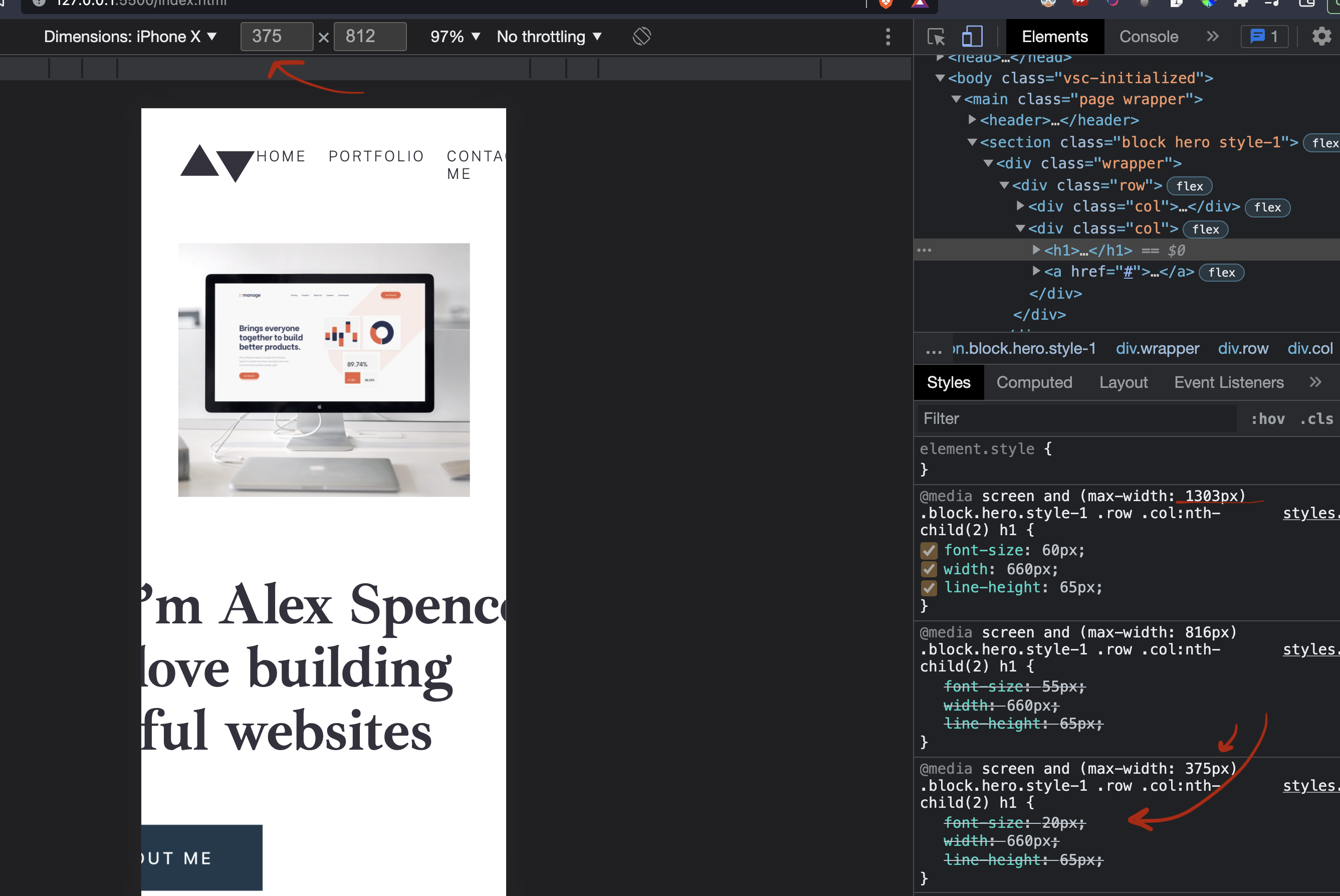
Goal: See the h1 font-size resize when it hits the 375px screen size.

What is actually happening is that it is applying the styles for the size 1303px screen.

It's crossing out the media query that would actually apply at that screen size (375px)...

What I've tried:

  • checked that I have this in the html <meta name="viewport" content="width=device-width, initial-scale=1.0">

  • tried min-width and tried to change values

         h1 {
       padding-bottom: 61px;
       font-family: $h1;
       font-weight: 700;
       font-size: 55px;
       letter-spacing: -0.45px;
       line-height: 50px;
       color: $primary-color-grey;
       width: 428px;
       position: absolute;
       left: 0px;
    
       @media screen and (max-width: 375px) {
         font-size: 20px;
         width: 660px;
         line-height: 65px;
       }
    
       @media screen and (max-width: 816px) {
         font-size: 55px;
         width: 660px;
         line-height: 65px;
       }
    
       @media screen and (max-width: 1303px) {
         font-size: 60px;
         width: 660px;
         line-height: 65px;
       }
     }
    

enter image description here

j08691
  • 204,283
  • 31
  • 260
  • 272
grimreaper
  • 35
  • 6
  • 1
    You have to change order of media query declarations. Start from the widest screen resolution to the smallest. `@media screen and (max-width: 1303px)` then `@media screen and (max-width: 816px)` and so on – szulbix Jan 15 '22 at 22:13
  • I figured this out right before I read your comment, thank you so much, it worked. – grimreaper Jan 15 '22 at 22:35

1 Answers1

1

It is normal to apply the 1303px media because to tell that it is max-width, it is mean that all the smaller screens will apply the style in addition to that it has come to the last style. So it will override all previous styles.

"szulbix" solution is very good for your case.