-2

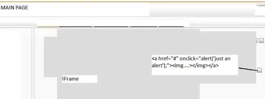
need make adaptation for the diagram in the screenshot below using Bootstrap 5 for mobile screens

enter image description here

Raptor
  • 53,206
  • 45
  • 230
  • 366

1 Answers1

-1

I know it made like this

<table class="table table-borderless">
  <tr>
    <td rowspan="2">C1</td>
    <td>C2</td>
  </tr>
  <tr>
   <td>C2</td>
  </tr>
  • That's not related. OP is asking Bootstrap 5. You should probably use `row` and `col-*` classes – Raptor Dec 30 '21 at 02:54
  • As it’s currently written, your answer is unclear. Please [edit] to add additional details that will help others understand how this addresses the question asked. You can find more information on how to write good answers [in the help center](/help/how-to-answer). – Community Dec 30 '21 at 05:35