Without using fixed elements how can I make the attached layout work for both desktop and mobile with either flex-box or w3.css? The rectangle on the left represents the desktop layout and the one on the right represents how it should look on mobile or narrower media. (no java) 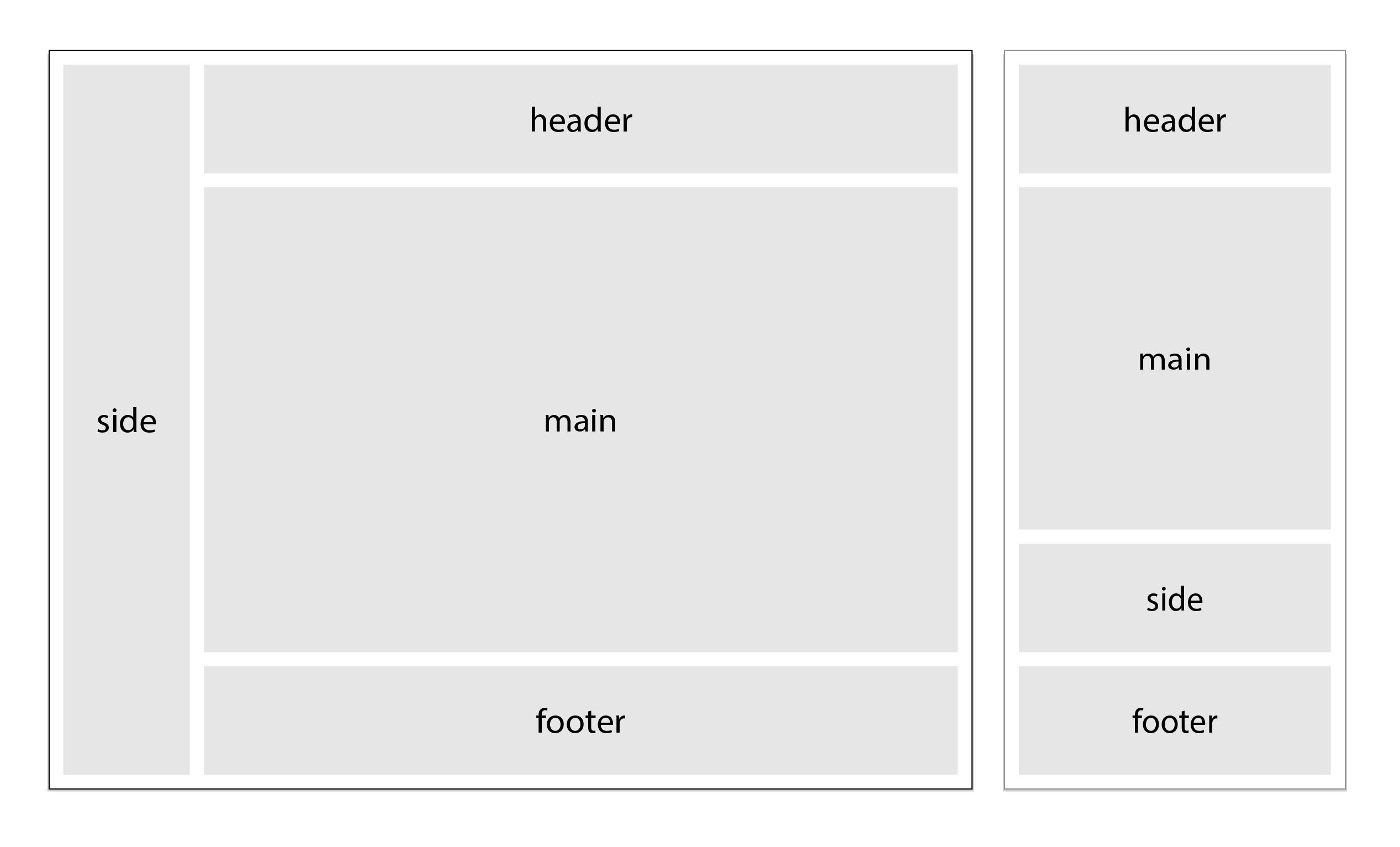
The header, footer and the sidebar will be sticky or have fixed element-like qualities but won't be fixed. I'm also interested in float solutions but they don't come off as elegant as flexbox. Also interested to hear if bootstrap could solve this more elegantly.
This is what I've got so far, but the side nav/bar is not full height.
body * {
  border: 1px solid black;
}

.flex-container {
  display: -ms-flexbox;
  /* IE10*/
  display: flex;
  -ms-flex-wrap: wrap;
  /*IE10*/
  flex-wrap: wrap;
  padding: 0 15px;
}

.header {
  -ms-flex: 100%;
  /*IE10*/
  flex: 100%;
  height: 70px;
  position: sticky;
  top: 0;
  z-index: +1;
  background-color: rgba(255, 255, 255, 1.00);
}

.aside {
  -ms-flex: 20;
  /*IE10*/
  flex: 20;
  height: 100%;
  position: sticky;
  top: 70px;
  padding: 0 40px 0 0;
}

.main {
  -ms-flex: 80;
  /*IE10*/
  flex: 80;
}

.footer {
  -ms-flex: 100%;
  /*IE10*/
  flex: 100%;
  position: sticky;
  bottom: 0;
  padding: 0 0 5px 0;
  background-color: rgba(255, 255, 255, 1.00);
}

.post {
  display: -ms-flexbox;
  /* IE10*/
  display: flex;
  -ms-flex-wrap: wrap;
  /*IE10*/
  flex-wrap: wrap;
  height: 500px;
  gap: 40px;
}

.post__story {
  -ms-flex: 3;
  /*IE10*/
  flex: 3;
}

.post__slider {
  -ms-flex: 7;
  /*IE10*/
  flex: 7;
}

@media (max-width: 800px) {
  .flex-container {
    flex-direction: column;
  }
  .post {
    flex-direction: column;
  }
  .header {
    order: 1;
  }
  .main {
    order: 2;
  }
  .aside {
    order: 3;
  }
  .footer {
    order: 4;
  }
  .navTop,
  .navBottom {
    width: 100%;
  }
}
<!doctype html>
<html>
<head>
<meta charset="utf-8">
<title>skeletal</title>
</head>
<body>
<div class="flex-container">
<header class="header"> header content </header>
<aside class="aside"> side bar/nav content
<div class="asideLeft__container">
<p>Lorem ipsum dolor sit amet, consectetur adipisicing elit. Quas, enim aliquid hic!</p>
<p>Lorem ipsum dolor sit amet, consectetur adipisicing elit. Dolor quidem pariatur, magnam.</p>
<address class="asideLeft__contact">
<p>Email</p> <br>
<p>Twitter</p> <br>
<p>Github</p>
</address>
</div>
</aside>
<main class="main">main content
<section class="post">
<article class="post__story"> Content for class "post__story" Goes Here
<p>Content for project story Goes Here</p>
</article>
<div class="post__slider"> Content for class "post__slider" Goes Here
<figure>This is the container for project image
<figcaption>This is the container for image caption</figcaption>
</figure>
</div>
</section>
</main>
<footer class="footer"> footer content </footer>
</div>
</body>
</html>