I would like to change the default bootstrap icon for accordions
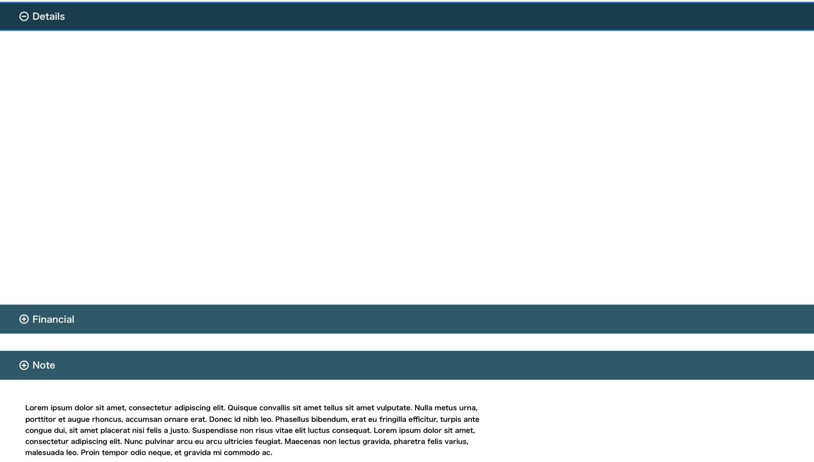
Instead of the default arrow icon, I would like to use the <i class="bi bi-plus-circle"></i> and the <i class="bi bi-dash-circle"></i> bootstrap icons.
One icon when accordion it's collapsed and the other icon when it's not collapsed.
Desired result:
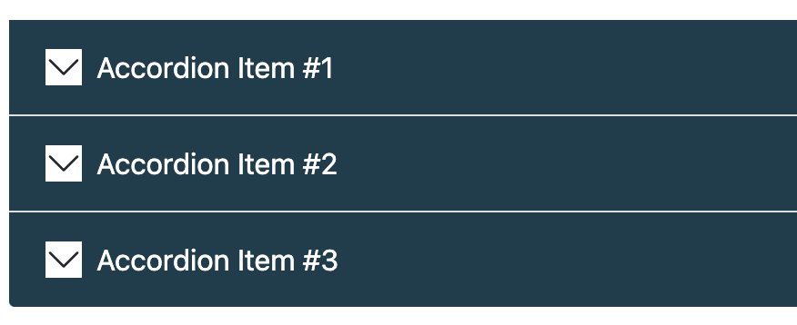
Current result:
As far as I know the default arrow icon comes from here (truncated):
.accordion-button::after {
    background-image: url(data:image/svg+xml,%3csvg xmlns='http://www.w3.org/2000/svg' viewBox='0 0 16 16' fill='%23212529'%3e%3cpath fill-rule='evenodd' d='M1.646 4.646a.5.5 0 0 1 .708 0L8 10.293l5.646-5.647a.5.5 0 0 1 .708.708l-6 6a.5.5 0 0 1-.708 0l-6-6a.5.5 0 0 1 0-.708z'/%3e%3c/svg%3e);

}
And it's basically set as a background-image.
When the user toggles, the background image is rotated 180 degrees:
.accordion-button:not(.collapsed)::after {
    background-image: url(data:image/svg+xml,%3csvg xmlns='http://www.w3.org/2000/svg' viewBox='0 0 16 16' fill='%230c63e4'%3e%3cpath fill-rule='evenodd' d='M1.646 4.646a.5.5 0 0 1 .708 0L8 10.293l5.646-5.647a.5.5 0 0 1 .708.708l-6 6a.5.5 0 0 1-.708 0l-6-6a.5.5 0 0 1 0-.708z'/%3e%3c/svg%3e);
    transform: rotate(
-180deg);
}
The first thing that comes to my mind is to replace both svg's for the desired bootstrap icons svg's and remove the rotation.
So I tried to replace the current SVG with the bootstrap icon svg:
.accordion-button::after {
    order: -1;
    margin-left: 0;
    margin-right:0.5em;
    background-image: url(data:image/svg+xml,%3csvg xmlns='http://www.w3.org/2000/svg' viewBox='0 0 16 16' fill='%23212529' fill-rule='evenodd' d='M8 15A7 7 0 1 1 8 1a7 7 0 0 1 0 14zm0 1A8 8 0 1 0 8 0a8 8 0 0 0 0 16z' d='M8 4a.5.5 0 0 1 .5.5v3h3a.5.5 0 0 1 0 1h-3v3a.5.5 0 0 1-1 0v-3h-3a.5.5 0 0 1 0-1h3v-3A.5.5 0 0 1 8 4z'/%3e%3c/svg%3e);
    background-color: white;
}
Unfortunately it did not work. Did I put the svg code wrong? is there a better way to achieve this?
(feel free to edit the code and try the svg code of any bootstrap icons)