I have created a new environment with Python 3.8.12 and installed the following packages:
matplotlib(3.4.3)pandas(1.3.3)scikit-learn(0.24.2)
I am running the code in a Jupyter notebook.
I am using code from two examples in the documentation for pandas.DataFrame.plot.scatter:
My output for the first example
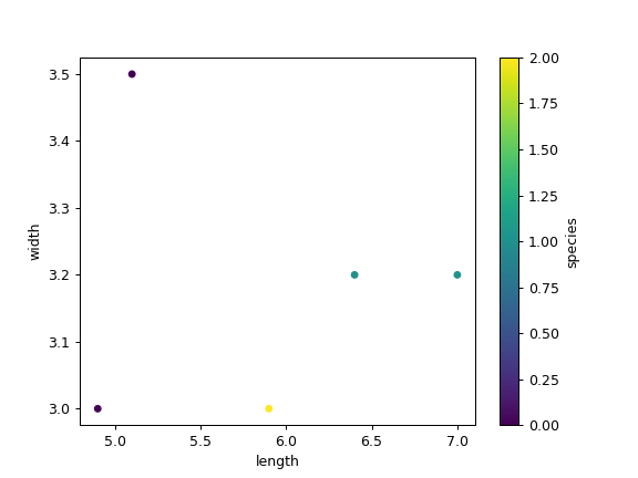
df = pd.DataFrame([[5.1, 3.5, 0], [4.9, 3.0, 0], [7.0, 3.2, 1],
                   [6.4, 3.2, 1], [5.9, 3.0, 2]],
                  columns=['length', 'width', 'species'])

ax1 = df.plot.scatter(x='length',
                      y='width',
                      c='DarkBlue')
does match the plot in the documentation.
However: my output for the second example
ax2 = df.plot.scatter(x='length',
                      y='width',
                      c='species',
                      colormap='viridis')
does not match the plot in the documentation: X axis label and minor tick labels do not show on the (bottom of the) plot.

My plot

I have tried ax2.set_xlabel("length") (which should be necessary) and it has no effect.
Is this a bug? Can someone please try and reproduce?