I'm trying to use <div> objects and CSS to emulate the appearance of frames for a project that I'm working on. Using the following code I was able to properly stretch the list on the left with a border-right, padding, and (if I choose) a background using only one extra element:
HTML:
<div id="sidebar">
    <div id="sidebar-content">
        <!-- content goes here -->
    </div>
</div>
<div id="content">
    <!-- more content -->
</div>
CSS:
html, body {
    height: 100%;
    margin: 0;
    padding: 0;
}

#sidebar {
    float: left;
    height: 100%;
    width: 200px;
    overflow: auto;
    border-right: solid 1px #000;
}

#sidebar-content {
    margin: 10px;
    padding: 0;
    list-style: none;
}

#content {
    position: relative;
    float: left;
    padding: 10px;
}
This worked well until I tried adding another element at the top of the content which stretched horizontally. Here's the current code:
HTML:
<div id="content">
    <div id="criteria">
        <!-- select boxes -->
    </div>
    <!-- other content -->
</div>
CSS:
#criteria {
position: absolute;
left: 0;
right: 0;
background: #FF9;
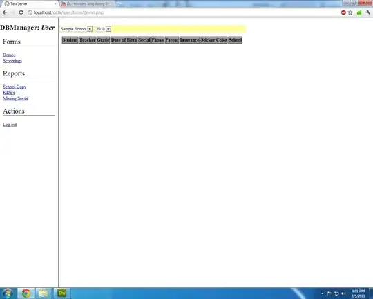
}
This picture shows the results
I tried adding the following rule:
#content {
    width: 100%;
}
although this stretched the #content div to the width of the body element, not the body minus the sidebar - so the content appeared below the fold (and beneath the sidebar on the left)
How can I use CSS to stretch the criteria box to fill the content area horizontally?
EDIT -
I wanted to upload a picture of what happened after Karl's recommendation:
Remove the
float: leftfrom#content. If there is a floated element next to a normal block element, the block element will fill the remaining space. Also don't set the width attribute.
Here's what happened when float: left was removed

Close, however now the #criteria is stretching to cover up the sidebar. Other suggestions?