10

I'm making an app bar in jetpack compose but I'm having spacing issues between the navigation icon and the title.

This is my compose function:

@Composable
fun DetailsAppBar(coin: Coin, backAction: () -> Unit) {
    TopAppBar(
        navigationIcon = {
            IconButton(onClick = { backAction() }) {
                Icon(
                    imageVector = Icons.Filled.ArrowBack,
                    contentDescription = null
                )
            }
        },
        title = { Text(text = "${coin.rank}. ${coin.name} (${coin.symbol})") }
    )
}

This is my preview function:

@Composable
@Preview
fun DetailsAppBarPreview() {
    val bitcoin = Coin(
        id = "",
        isActive = true,
        name = "Bitcoin",
        rank = 1,
        symbol = "BTC"
    )
    DetailsAppBar(coin = bitcoin, backAction = {})
}

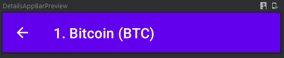
This is the visual preview of my compose function: Preview of customized app bar

This is the space I want to reduce:

Space to reduce in app bar

Entering the code of the TopAppBar compose function I can't see any parameters that allow me to do this.

Pierre Vieira
  • 2,252
  • 4
  • 21
  • 41

2 Answers2

3

Actually it is possible to reduce space between icon and and title but it's a little bit tricky. Just add negative offset to modifier of text like that

@Composable
fun DetailsAppBar(coin: Coin, backAction: () -> Unit) {
    TopAppBar(
        navigationIcon = {
            IconButton(onClick = { backAction() }) {
                Icon(
                    imageVector = Icons.Filled.ArrowBack,
                    contentDescription = null
                )
            }
        },
        title = {
            Text(
                text = "${coin.rank}. ${coin.name} (${coin.symbol})",
                modifier = Modifier.offset(x = (-16).dp)
            )
        }
    )
}

  
2

You are right. With the variant of TopAppBar you are using, this is not possible. This is because the width of the NavigationIcon is set to the default (72.dp - 4.dp). You can check the implementation of TopAppBar and see that it uses the below:

private val AppBarHorizontalPadding = 4.dp

// Start inset for the title when there is a navigation icon provided
private val TitleIconModifier = Modifier.fillMaxHeight()
    .width(72.dp - AppBarHorizontalPadding)

What you could do is to use the other variant of the TopAppBar that gives you much more control in placing the title and icon. It could be something like:

@Composable
fun Toolbar(
    @StringRes title: Int,
    onNavigationUp: (() -> Unit)? = null,
) {
    TopAppBar(backgroundColor = MaterialTheme.colors.primary) {
        Row(
            modifier = Modifier
                .fillMaxWidth()
                .height(56.dp)
        ) {
            // Title
            Text(...)
            
            // Navigation Icon
            if (onNavigationUp != null) {
                Icon(
                    painter = painterResource(id = R.drawable.ic_back),
                    contentDescription = stringResource(
                        id = R.string.back
                    ),
                    tint = MaterialTheme.colors.onPrimary,
                    modifier = Modifier
                        .clip(MaterialTheme.shapes.small)
                        .clickable { onNavigationUp() }
                        .padding(16.dp)
                        ...... ,
                )
            }
        }
    }
}

Henry
  • 17,490
  • 7
  • 63
  • 98