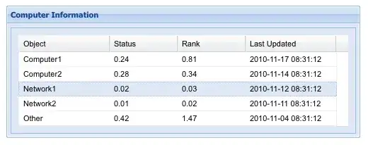
I am trying to replicate the bar plot as shown bellow.
Here is an example of the data frame. Where the y variable is tasa and the x variable is year, and the number showed in the text of each x tick label is inscripciones.
df <- structure(list(year = c("2018", "2019"), inscripciones = c(3038910, 3680696), tasa = c(88.9528707645112, 104.692208214133)), class = c("tbl_df", "tbl", "data.frame"), row.names = c(NA, -2L))

p <- ggplot(data = df, aes(x = year, y = tasa)) +
  geom_bar(width = 0.4, stat = "identity", fill="orange")+
  geom_text(aes(year, tasa + 5, label = round(tasa,2), fill = NULL), size=4)+
  labs(x = NULL, y = NULL)+
  scale_y_continuous(breaks = seq(0, 110, by = 10))+
  theme_bw()
How can I add these long text including information from the dataframe to the x tick labels?

