4

I have a game that looks a bit like a game from 1980. And i have this dialog:

#firstPageText {
            width: 300px;
            min-height: 100px;
            border: 2px solid;
            padding: 1em;
            margin: 0;
            position: absolute;
            bottom: 50px;
            left: 50%;
            -ms-transform: translate(-50%, 0%);
            transform: translate(-50%, 0%);
            font-family: 'Press Start 2P', cursive;
            border-radius: 5px;
        }
<link rel="preconnect" href="https://fonts.googleapis.com">
    <link rel="preconnect" href="https://fonts.gstatic.com" crossorigin>
    <link href="https://fonts.googleapis.com/css2?family=Press+Start+2P&display=swap" rel="stylesheet">

<p id="firstPageText">
  This is a test text.
</p>

I wanted to add a border-radius to this dialog like the ones from pokemon:

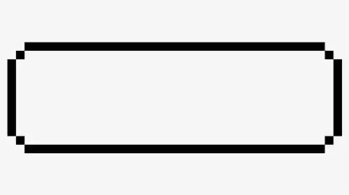
Is there a way to achieve this pixeled border-radius, instead of the rounded border-radius?

2 Answers2

2

I would consider mulitiple background:

#firstPageText {
  --b:5px;  /* the thickness */
  --c:#000; /* the color */
  width: 300px;
  min-height: 100px;
  font-family: 'Press Start 2P', cursive;
  padding:calc(5*var(--b));
  position:relative;
}
  
#firstPageText::before,
#firstPageText::after { 
  content:"";
  position:absolute;
  inset:0 0 50% 0;
  background:
    linear-gradient(var(--c) 0 0) 50%   0  /calc(100% - 4*var(--b)) var(--b),
    linear-gradient(var(--c) 0 0) 0%   100%/var(--b) calc(100% - 2*var(--b)),
    linear-gradient(var(--c) 0 0) 100% 100%/var(--b) calc(100% - 2*var(--b)),
    conic-gradient(from  90deg,var(--c) 90deg,#0000 0) 0    0/calc(2*var(--b)) calc(2*var(--b)),
    conic-gradient(from 180deg,var(--c) 90deg,#0000 0) 100% 0/calc(2*var(--b)) calc(2*var(--b));
  background-repeat:no-repeat;
}
#firstPageText::after {
  transform-origin:bottom;
  transform:scaleY(-1);
}
<p id="firstPageText">
  This is a test text.
</p>

Apply different colors to understand the puzzle:

#firstPageText {
  --b:10px; /* adjust this */
  width: 300px;
  min-height: 100px;
  font-family: 'Press Start 2P', cursive;
  padding:calc(5*var(--b));
  position:relative;
}
  
#firstPageText::before,
#firstPageText::after { 
  content:"";
  position:absolute;
  inset:0 0 50% 0;
  background:
    linear-gradient(red 0 0) 50%   0  /calc(100% - 4*var(--b)) var(--b),
    linear-gradient(blue 0 0) 0%   100%/var(--b) calc(100% - 2*var(--b)),
    linear-gradient(green 0 0) 100% 100%/var(--b) calc(100% - 2*var(--b)),
    conic-gradient(from  90deg,orange 90deg,lightblue 0) 0    0/calc(2*var(--b)) calc(2*var(--b)),
    conic-gradient(from 180deg,purple 90deg,lightblue 0) 100% 0/calc(2*var(--b)) calc(2*var(--b));
  background-repeat:no-repeat;
}
#firstPageText::after {
  transform-origin:bottom;
  transform:scaleY(-1);
  filter:hue-rotate(180deg);
}
<p id="firstPageText">
  This is a test text.
</p>
Temani Afif
  • 245,468
  • 26
  • 309
  • 415
  • Hi Temani, could you please check this question? https://stackoverflow.com/questions/68744811/first-letter-also-styles-first-character. As a css hacker you may have a clean solution for this :o –  Aug 11 '21 at 16:36
0
  • of what i see i don't think that this is a normal border radius or even svg i think those are multiple elements desgined like this way
<!DOCTYPE html>
 <html>
 <head>
     <title></title>
     <meta charset="utf-8" />
     <style>
        .box {
            width: 230px;
            min-height: 100px;
            margin: 25px auto;
            position: relative;
        }
        .top {
            height: 10px;
            background: #000;
            width: 85%;
            position: absolute;
            top: 0;
            left: 50%;
            transform: translateX(-50%);
        }
        .right {
            height: 65%;
            background: #000;
            width: 10px;
            position: absolute;
            right: 0;
            top: 50%;
            transform: translateY(-50%);
            z-index: 1;
        }
        .bottom {
            height: 10px;
            background: #000;
            width: 85%;
            position: absolute;
            bottom: 0;
            left: 50%;
            transform: translateX(-50%);
        }
        .left {
            height: 65%;
            background: #000;
            width: 10px;
            position: absolute;
            left: 0;
            top: 50%;
            transform: translateY(-50%);
        }
        /*                  Squares                 */
        .top:before {
            content: "";
            height: 80%;
            background: #000;
            width: 8px;
            position: absolute;
            right:0;
            bottom: -40%;
            z-index: 99;
            transform: translate(85%, 50%)
        }
        .right:before {
            content: "";
            height: 8px;
            background: #000;
            width: 80%;
            position: absolute;
            right:0;
            bottom: -40%;
            z-index: 99;
            transform: translate(-100%, -230%)
        }
        
        .bottom:before {
            content: "";
            height: 80%;
            background: #000;
            width: 8px;
            position: absolute;
            left:0;
            bottom: -40%;
            z-index: 99;
            transform: translate(-90%, -170%)
        }
        
        .left:before {
            content: "";
            height: 8px;
            background: #000;
            width: 80%;
            position: absolute;
            right:0;
            top: -40%;
            z-index: 99;
            transform: translate(100%, 230%)
        }
     </style>
 </head>
     <body>
    <div class="box">
        <div class="top"></div>
        <div class="right"></div>
        <div class="bottom"></div>
        <div class="left"></div>
    </div>
     </body>
 </html>
  • it's not a scalable box it's a box with static width and when change the width you will be need to handle squares to be computable with the new width
JS_INF
  • 467
  • 3
  • 10
  • Thank you so much for your efforts. Unfortunately, what I need is that it usually changes the height and in your example it is not appropriate. Thanks anyway, you get a +1 for your effort. –  Jul 30 '21 at 13:49