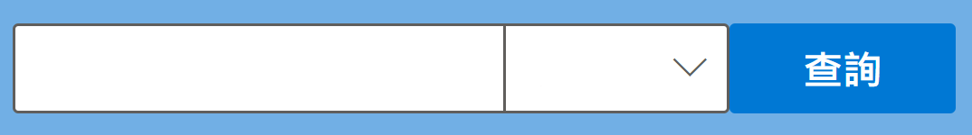
I am making a user input control which is composed of a TextField, a Dropdown, and a Button.
To make the TextField and Dropdown looks like a whole rather than two separate controls, I
added two styles (borderTopLeftRadius and borderBottomLeftRadiustried) to the TextField to remove its rounded corner, but it's not working as expected.

This is what I'm hoping for:
Here's the related code, in TypeScript:
import React from 'react';
import { Stack, Text, Link, Dropdown, IDropdownStyles, ITextFieldStyleProps, IStackTokens, IStackStyles, ITextStyles, IDropdownOption, DropdownMenuItemType, PrimaryButton, TextField, initializeIcons, ITextFieldStyles } from '@fluentui/react';

const optionsFilterType: IDropdownOption[] = [
  { key: 'opt0', text: 'A', data: '11'},
  { key: 'opt1', text: 'B', data: '22' },
  { key: 'opt2', text: 'C', data: '33' },
];

<Stack horizontal>
  <TextField className="TTTT"
     style={{borderTopRightRadius: 0, borderBottomRightRadius: 0}}
     placeholder="---------Text----------" />
  <Dropdown
    style={{borderTopLeftRadius: 0, borderBottomLeftRadius: 0}}
    placeholder="---------Text----------"
    options={optionsFilterType}
    defaultSelectedKey="opt1" />
  <PrimaryButton text="查詢" />
</Stack>
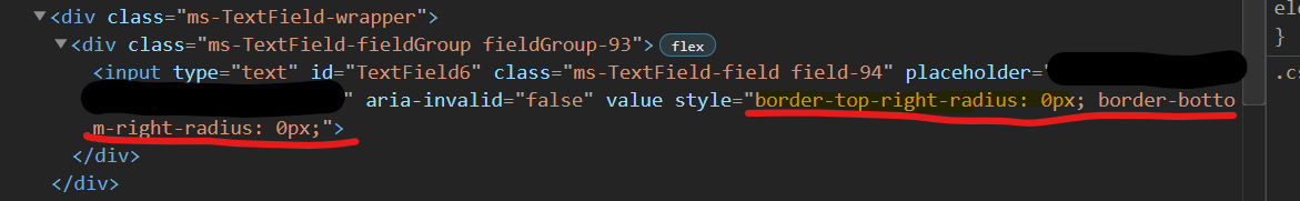
By looking at the final rendered elements using the Developer Tool on the browser, I notice the style mentioned is applied on the <input> tag, not its parent aka. <div>, I know that if the style is applied on the parent <div> the rounded corner is gone, but how can I add the style correctly?
Thanks.