I'm trying to make a layout like this:

In order to do so, I've made two components named HalfWidthFullHeightCard and HalfWithHalfHeightCard.
I've created the HalfWidthFullHeightCell component as?
        <TouchableOpacity onPress={pressEvent}>
            <ImageBackground
                source={sourcePath}
                imageStyle={{ borderRadius: 8, resizeMode: 'cover', width: '100%' }}
                style={styles.halfWidthCard}>
                <Text style={styles.halfWidthCardHeading}>{heading}</Text>
                <Text style={styles.halfWidthCardText}>{cardText}</Text>
            </ImageBackground>
        </TouchableOpacity>
...
    halfWidthCard: {
        backgroundColor: colors.brightYellow,
        marginBottom: 10,
        borderRadius: 8,
    },
Based on the cardText the width of the card is calculated automatically and in the halfWidthCardText StyleSheet I've only had padding: 10
Next for HalfWithHalfHeightCard everything is the same except for the styling which is:
...

    smallHalfWidthCard: {
        backgroundColor: colors.brightYellow,
        borderRadius: 8,
        marginBottom: 10
    },
    smallHalfWidthCardHeading: {
        padding: 10,
    },
    smallHalfWidthCardText: {
        padding: 10,
    },
Where I'm putting both of these components together I'm doing:
<ScrollView contentContainerStyle={{padding: 15}}>
    <View style={{flexDirection: 'row',}}>
                <HalfWidthFullHeightCell />
                <View>
                    <HalfWithHalfHeightCell />
                    <HalfWithHalfHeightCell />
                </View>
    </View>
</ScrollView>
Now there are two problems:
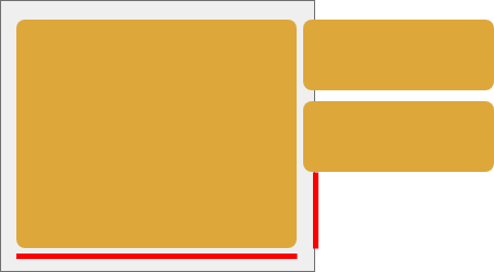
- Consider the gray area as the width of the device. The
HalfWidthFullHeightCardtakes 100% of the space and - The
HalfWithHalfHeightCardare outside of the screen and also not of the same height asHalfWidthFullHeightCard.
So, how can I make these components flexible so that they adapt to the layout as screen size changes?