21

I've generated chart form google spreadsheets. In my report for horizontal axis I have values: 1 ,2 ,3 ,4 ,5 ,10 ,20 ,30 ,40 ,50 ,100 ,200 ,300 ,400 ,500 ,600 ,700 ,800 ,900 ,1000. Chart interprets them as a labels, not a number:

enter image description here

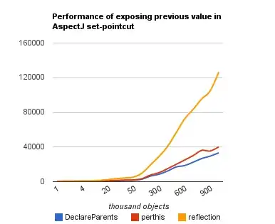
So the distance between 1 and 4 is the same as between 20 and 50. How to change it? (Maybe I have to transform input data - how?)

Here is my spreadsheet with input data, query and the chart.

I want to embed it in a webpage with such script:

    <script type="text/javascript" src="//ajax.googleapis.com/ajax/static/modules/gviz/1.0/chart.js"> 
{"dataSourceUrl":"//spreadsheets.google.com/spreadsheet/tq?key=0AtdHElsKyNw9dERVZ1lZRVNmYmRqSlVVbWszd3BVdGc&transpose=0&headers=1&range=F1%3AI21&gid=0&pub=1",
"options":{
    "reverseCategories":false,"titleX":"thousand objects","backgroundColor":"#FFFFFF","pointSize":0,
    "width":510,
    "vAxis":{"format":"#0.##########"},
    "smoothLine":true,"lineWidth":2,"logScale":false,"hasLabelsColumn":true,
    "hAxis":{"maxAlternation":1},
    "vAxes":[{"min":null,"title":"ms","max":null,"maxValue":null}],
    "title":"Performance of exposing previous value in AspectJ set-pointcut",
    "height":400,"interpolateNulls":false,"legend":"bottom","reverseAxis":false
},
"state":{},
"chartType":"LineChart",
"chartName":"Performance test"
} </script>
zacheusz
  • 8,750
  • 3
  • 36
  • 60

3 Answers3

13

You can do this by configuring the vertical axis in the Advanced Settings area.

enter image description here

I just did and it worked like a charm. :)

Josh Koenig
  • 399
  • 3
  • 8
  • 7
    are you sure that "Log scale" doesn't mean "Logarithmic scale" ? Look here: http://support.google.com/drive/bin/answer.py?hl=en&answer=63824 "Log scale sets a logarithmic scale to your data" – zacheusz Jan 25 '13 at 19:49
  • 1
    Is there possible to make a logarithmic scale on google sheet with exotic log power (like 1 3 9 27 ...)? Or is it fixed? – Brighter side May 08 '18 at 08:39
6

I found other solution. Use type for X axis data as "number" (not as string) and line chart

Check that documentation for details: https://developers.google.com/chart/interactive/docs/customizing_axes#Discrete_vs_Continuous

Andrzej
  • 61
  • 1
  • 2
  • This answer would be much more helpful if you added an explanation on how you did this, linking to the explanation as a source, not as the explanation. Also, that would make this answer be in line with the SE guidelines for how an answer should be written. – Canned Man Apr 12 '21 at 20:02
6

In Google Spreadsheet, the only chart type that I know understand the axes as numbers is the Scatter.

If it does not suit you (e.g. because you want a line specifically), then you have to work the data. That is, you have to determine a fixed step your axes, e.g. 10 (or any other resolution you find necessary) and fill the data columns using some formula based on your data, like a linear regression between the adjacent points, or a polynomial interpolation.

I'm not very skilled in the QUERY function, maybe it can help you do it automagically. I only know how to do it using other "more complicated" formulas structures with ArrayFormulas and so.

Henrique G. Abreu
  • 17,406
  • 3
  • 56
  • 65