1

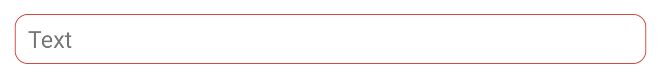
I am trying to achieve a simple rounded corner layout with a colored background on two specific MaterialTextViews. Codes are below:

 <com.google.android.material.textview.MaterialTextView
    android:id="@+id/lblStartTime"
    style="@style/customTimeRangePickerStyle"
    android:layout_width="68dp"
    android:layout_height="wrap_content"
    android:padding="8dp"
    android:textAlignment="center"
    android:textSize="18sp" />

<style name="customTimeRangePickerStyle" parent="">
    <item name="shapeAppearanceOverlay">@style/customTimeRangePickerDay</item>
</style>

<style name="customTimeRangePickerDay" parent="">

    <item name="cornerFamily">rounded</item>
    <item name="cornerSize">4dp</item>

    <item name="strokeWidth">1dp</item>
    <item name="strokeColor">@color/Cor2</item>

    <item name="android:background">@color/fieldBackground</item>
</style>

Any tips why this is not working? The resulting textview shows no borders nor background color.

Thanks!

Gabriele Mariotti
  • 320,139
  • 94
  • 887
  • 841

1 Answers1

1

Currently (1.3.0) the MaterialTextView doesn't use a MaterialShapeDrawable and doesn't support the ShapeAppearanceModel and shapeAppearance/shapeAppearanceOverlay attributes.

More info a about the supported components in the doc.

However you can apply a MaterialShapeDrawable:

      <com.google.android.material.textview.MaterialTextView
          android:id="@+id/textview"
          android:paddingLeft="8dp"
          android:gravity="center_vertical"
          android:backgroundTint="@color/white"
          android:text="Text"
          />

and:

val radius = resources.getDimension(R.dimen.default_corner_radius)

val textView = findViewById<TextView>(R.id.textview)
val shapeAppearanceModel = ShapeAppearanceModel()
    .toBuilder()
    .setAllCorners(CornerFamily.ROUNDED, radius)
    .build()

val shapeDrawable = MaterialShapeDrawable(shapeAppearanceModel)
shapeDrawable.setStroke(2.0f, ContextCompat.getColor(this,R.color.red600));
ViewCompat.setBackground(textView, shapeDrawable)

enter image description here

You can also build the ShapeAppearanceModel using an overlay defined in the theme. Just use in the code above:

 val shapeAppearanceModel =
            ShapeAppearanceModel.builder( context,
                    R.style.ShapeAppearance_MaterialComponents_SmallComponent,
                    R.style.shapeAppearanceOverlay)
            .build()

with:

<style name="shapeAppearanceOverlay">
    <item name="cornerFamily">rounded</item>
    <item name="cornerSize">xxx</item>
</style>
Gabriele Mariotti
  • 320,139
  • 94
  • 887
  • 841
  • Thanks Gabriele, I missed that point. This would not solve my current issue, though. The reason I tried the overlay is because I need to be able to change the background drawable shape for Day/Night themes compatibility and was not willing to create two different drawables for that. Any suggestions? – Ilian Felinto Mar 24 '21 at 20:08
  • @IlianFelinto I've updated the answer. You can build the `ShapeAppearanceModel` using an `shapeAppearanceOverlay` defined in the style. In this way you can define it in the day/night theme files. – Gabriele Mariotti Mar 24 '21 at 20:57
  • I have changed the object type to MaterialButton and now I can see the correct shape. But it totally ignores the strokeColor, strokeWidth and background(color) items. Also, is the only way to do it is programatically, or the property "style" is ok on the xml definition file? – Ilian Felinto Mar 24 '21 at 21:24