I have the following SpinBox model which I am trying to recreate using the new QtQuick.Control 2, because this one it's using version 1. And I've encountered some problems which I am not sure how to solve.
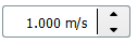
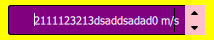
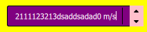
- On the validation side, I should not be able to write anything on the suffix side, just on the number part. Also I should not be allowed to remote the suffix from there while editing
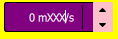
- My width should be fixed and I should not be allowed to write more than that.
My Code:
import QtQuick 2.6
import QtQuick.Controls 2
import QtQuick.Controls.Styles 1.4
import QtGraphicalEffects 1.0

SpinBox {
    id: root
    property color borderColor: "red"
    property string multipleValuesTooltip: ""
    property color backgroundColor: "yellow"
    property bool showTooltip: true
    font.pointSize: 10

    property int maximumValue: 50
    property int minimumValue: 0
    property string suffix: ""
    property int decimals: 0
    to: maximumValue
    from: minimumValue
    editable: true
    rightPadding:  {
        console.log(root.contentItem.height)
        return Math.max(40, Math.round(root.contentItem.height))
    }

    textFromValue: function(value, locale) {
        return qsTr("%1"+suffix).arg(value);
    }

    contentItem: TextInput {
        z: 5
        text: root.textFromValue(root.value, root.locale)

        font: root.font
        color: "white"
        selectionColor: "#21be2b"
        selectedTextColor: "#ffffff"
        horizontalAlignment: Qt.AlignHCenter
        verticalAlignment: Qt.AlignVCenter
        validator: root.validator
        inputMethodHints: Qt.ImhFormattedNumbersOnly
    }
    up.indicator: Rectangle {
        height: parent.height / 2
        anchors.right: parent.right
        anchors.top: parent.top
        implicitWidth: 20 // Adjust width here
        implicitHeight: {
            console.log(root.contentItem.height)
            return root.contentItem.height - 10
        }
        color: root.up.pressed ? "red" : "pink"
        Image {
            source: "qrc:/resources/arrow-down.png"
            height: Math.min(15, sourceSize.height)
            width: Math.min(30, sourceSize.width)
            anchors.centerIn: parent
            rotation: 180
        }
    }
    down.indicator: Rectangle {
        height: parent.height / 2
        anchors.right: parent.right
        anchors.bottom: parent.bottom
        implicitHeight: root.contentItem.height - 10
        implicitWidth: {
            console.log("W: ",root.width)
            return 20
        }
        color: root.down.pressed ? "red" : "pink"

        Image {
            source: "qrc:/resources/arrow-down.png"
            height: Math.min(15, sourceSize.height)
            width: Math.min(30, sourceSize.width)
            anchors.centerIn: parent
        }
    }
    background: Item {
        implicitHeight: root.height === 0 ? Math.max(30, Math.round(root.contentItem.height * 1.2)) : root.height
        implicitWidth: root.contentItem.width + leftPadding +rightPadding

        baselineOffset: root.anchors.baselineOffset

        Rectangle {
            id: baserect
            anchors.fill: parent
            color: "purple"
            radius: 3
        }

        Rectangle { // Border only
            anchors.fill: parent
            border.color: "black"
            color: "transparent"
            radius: 3
        }

        Rectangle {
            anchors.right: parent.right
            anchors.rightMargin: root.rightPadding - 10
            anchors.verticalCenter: parent.verticalCenter
            color: "black"
            height: parent.height - parent.height/5
            width: 1
        }
    }
}
I couldn't find any documentation or any kind of information regarding this wherever I've searched for. If any of you could help me I would be really grateful.