0

I have a list which is made by Vue.js

Here is my code:

<ul>
    <li
        v-for="category in item.children"
        :key="category.id"
        class="menu-item"
    >
        <nuxt-link
            :to="
                localePath(
                    `/category/${category.slug}/${category.id}`
                )
            "
        >
            <h5>{{ category.lang[0].name }}</h5>
        </nuxt-link>
        <ul class="mega-menu__list">
            <li
                v-for="subItem in category.children"
                :key="subItem.id"
            >
                <nuxt-link
                    :to="
                        localePath(
                            `/category/${subItem.slug}/${subItem.id}`
                        )
                    "
                >
                    {{ subItem.lang[0].name }}
                </nuxt-link>
            </li>
        </ul>
    </li>
</ul>

enter image description here

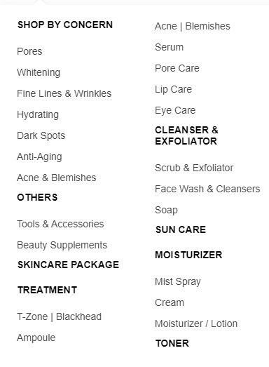
But I want it to display like this which child is in the same column:

enter image description here

Any help is appreciated.

Johannes
  • 64,305
  • 18
  • 73
  • 130
BlackLotus
  • 496
  • 2
  • 9
  • 24
  • 3
    The answer depends on your current styles. Can you update the question to include the CSS? – tony19 Mar 11 '21 at 09:09
  • Oh my god... A list inside a list... where the first list is not a list but a `div` and each `li` is a `section`... – matiaslauriti Apr 10 '21 at 00:52
  • @matiaslauriti what is your recommendation to change this? – BlackLotus Apr 10 '21 at 01:42
  • Think that everything is a box, if it is a "list of menus" then, each different menu is a box, so each menu should be in a `div` or `section` (they have to have a parent `div` because they are the whole thing). Then, each menu can be a `ul` from each section. Still, doing so, will not prevent your content from showing as you want, but at least will not cut a menu in half. The parent block has to have a defined height or use `grid` box. – matiaslauriti Apr 10 '21 at 01:55
  • @matiaslauriti sorry, but i dont really understand what you said, can you show me sample coding? – BlackLotus Apr 10 '21 at 02:24
  • Yes, give me some minutes as I code it. – matiaslauriti Apr 10 '21 at 02:25

1 Answers1

1

* {
  font-family: "Arial";
  font-size: 15px;
  margin: 0;
  padding: 0;
}

section {
    display: flex;
    flex-direction: column;
    flex-wrap: wrap;
    width: 450px;
    height: 800px;
    margin: 0 auto;
}

div {
    display: flex;
    flex-direction: column;
    padding: 15px 30px;
}

h5 {
    margin-bottom: 20px;
    text-transform: uppercase;
}

ul {
    list-style: none;
}

li {
    line-height: 30px;
}
<section>
    <div>
        <h5>shop by concern</h5>
        <ul>
            <li>Pores</li>
            <li>Whitening</li>
            <li>Fine Lines &amp; Wrinkles</li>
            <li>Hydrating</li>
            <li>Dark Spots</li>
            <li>Anti-Aging</li>
            <li>Acne &amp; Blemishes</li>
        </ul>
    </div>
    <div>
        <h5>others</h5>
        <ul>
            <li>Tools &amp; Accessories</li>
            <li>Beauty Supplements</li>
        </ul>
    </div>
    <div>
        <h5>skincare package</h5>
    </div>
    <div>
        <h5>treatment</h5>
        <ul>
            <li>T-Zone &vert; Blackhead</li>
            <li>Ampoule</li>
            <li>Acne &vert; Blemishes</li>
            <li>Serum</li>
            <li>Pore Care</li>
            <li>Lip Care</li>
            <li>Eye Care</li>
        </ul>
    </div>
    <div>
        <h5>cleanser &amp; exfoliator</h5>
        <ul>
            <li>Scrub &amp; Exfoliator</li>
            <li>Face Wash &amp; Cleansers</li>
            <li>Soap</li>
        </ul>
    </div>
    <div>
        <h5>sun care</h5>
    </div>
    <div>
        <h5>moisturizer</h5>
        <ul>
            <li>Mist Spray</li>
            <li>Cream</li>
            <li>Moisturizer / Lotion</li>
        </ul>
    </div>
    <div>
        <h5>toner</h5>
    </div>
</section>

See in my example, that if you have enough height (css), a menu will try to get there, if not, it will go to the right (because it has space to go there because of flex-wrap: wrap. Play with each CSS property in section and div, and you will understand more.

You can see more about flex here. And if you want to try out grid, here.

matiaslauriti
  • 7,065
  • 4
  • 31
  • 43