I want to apply custom ticks to my plot with matplotlib to offset the labels of a 3D bar graph by half the column width, similar to this post. Here is my code:
from matplotlib import pyplot as plt
from numpy import arange, meshgrid, abs, zeros_like
import mpl_toolkits.mplot3d

def barplot3d(x, y, z, centerLabels = True):
    x0 = x[:, 0]
    y0 = y[0, :]
    x = x.flatten()
    y = y.flatten()
    z = z.flatten()
    z0 = zeros_like(z)
    fig = plt.figure()
    ax = fig.add_subplot(111, projection = "3d")
    ax.set_xticks(x0 + 0.5)
    ax.set_xticklabels(x0)
    ax.set_yticks(y0 + 0.5)
    ax.set_yticklabels(y0)
    ax.bar3d(x, y, z0, 1, 1, z)
    plt.show()

x = arange(-10, 10)
y = arange(10)
mx, my = meshgrid(x, y, indexing = "ij")
z = abs(mx * my - (mx + 2 * my))

barplot3d(mx, my, z)
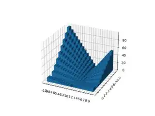
It works fine. However, this will always plot all ticks, one for each row/column in z which results in crowded x and y axes. See the following image of the plot created usign the above code:
How can I adjust this so that it is as close as possible to the result I would obtain from using the automatically created labels? That is, how can I decide which labels to take and which to discard? Can I still somehow use the automated "system" that decides this while specifying the label positions?
