The cdf can be calculated via scipy.stats.norm.cdf(). Its ppf can be used to help map the desired correspondences. scipy.interpolate.pchip can then create a function to so that the transformation interpolates smoothly.
import matplotlib.pyplot as plt
from matplotlib.ticker import PercentFormatter
import numpy as np
from scipy.interpolate import pchip # monotonic cubic interpolation
from scipy.stats import norm
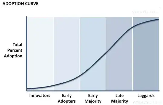
desired_xy = np.array([(30, 10), (40, 20)]) # (number of days, percentage adoption)
# desired_xy = np.array([(0, 1), (30, 10), (40, 20), (90, 99)])
labels = ['Innovators', 'Early\nAdopters', 'Early\nMajority', 'Late\nMajority', 'Laggards']
xmin, xmax = 0, 90 # minimum and maximum day on the x-axis
px = desired_xy[:, 0]
py = desired_xy[:, 1] / 100
# smooth function that transforms the x-values to the corresponding spots to get the desired y-values
interpfunc = pchip(px, norm.ppf(py))
fig, ax = plt.subplots(figsize=(12, 4))
# ax.scatter(px, py, color='crimson', s=50, zorder=3) # show desired correspondances
x = np.linspace(xmin, xmax, 1000)
ax.plot(x, norm.cdf(interpfunc(x)), lw=4, color='navy', clip_on=False)
label_divs = np.linspace(xmin, xmax, len(labels) + 1)
label_pos = (label_divs[:-1] + label_divs[1:]) / 2
ax.set_xticks(label_pos)
ax.set_xticklabels(labels, size=18, color='navy')
min_alpha, max_alpha = 0.1, 0.4
for p0, p1, alpha in zip(label_divs[:-1], label_divs[1:], np.linspace(min_alpha, max_alpha, len(labels))):
ax.axvspan(p0, p1, color='navy', alpha=alpha, zorder=-1)
ax.axvline(p0, color='white', lw=1, zorder=0)
ax.axhline(0, color='navy', lw=2, clip_on=False)
ax.axvline(0, color='navy', lw=2, clip_on=False)
ax.yaxis.set_major_formatter(PercentFormatter(1))
ax.set_xlim(xmin, xmax)
ax.set_ylim(0, 1)
ax.set_ylabel('Total Adoption', size=18, color='navy')
ax.set_title('Adoption Curve', size=24, color='navy')
for s in ax.spines:
ax.spines[s].set_visible(False)
ax.tick_params(axis='x', length=0)
ax.tick_params(axis='y', labelcolor='navy')
plt.tight_layout()
plt.show()

Using just two points for desired_xy the curve will be linearly stretched. If more points are given, a smooth transformation will be applied. Here is how it looks like with [(0, 1), (30, 10), (40, 20), (90, 99)]. Note that 0 % and 100 % will cause problems, as they lie at minus at plus infinity.