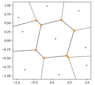
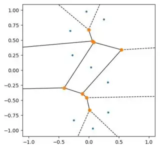
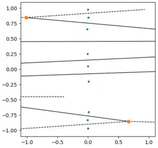
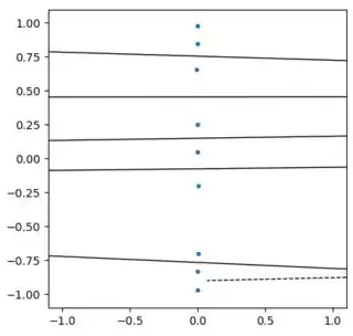
You are looking at the plot of the correct Voronoi diagram. With such a mismatch of scales, you points basically all lie on a vertical line and thus the boundaries between the Voronoi cells are horizontal lines. This can be confusing on a plot with different scales on the axes. Here is an example with a fixed scale for the plot. In the progression of plots, the points generating the Voronoi cells are getting progressively squeezed together in the x direction.


The images above were generated with the following code using scale = 1, 0.33, 0.1, 0.033, 0.01 and 0.0033.
import numpy as np

scale = 0.0033

points = np.array([[0.1, 0.05], [-0.13, 0.98], [0.2, -0.97],
                   [0.95, -0.2], [0.76, 0.85], [0.98, -0.7],
                   [-0.83, 0.25], [-0.94, 0.66], [-0.76, -0.83]])

points = points*[scale,1]

from scipy.spatial import Voronoi, voronoi_plot_2d
vor = Voronoi(points)

import matplotlib.pyplot as plt

fig = voronoi_plot_2d(vor)

ax = plt.gca()
ax.axis([-1.1, 1.1, -1.1, 1.1])
ax.set_aspect('equal', adjustable='box')
plt.show()
If you want your Voronoi diagram to look "normal" with a mismatched scaling of the axes, you should scale your points before constructing the Voronoi diagram and then scale the results back to your original problem space.


