I am using Flutter ElevatedButton, which is recommended over RaisedButton in the docs.
In raised button, you could specify and disabledColor. In ElevatedButton, I can not.
How can I stylize what the ElevatedButton looks like when it is disabled?
You can copy paste run full code below
You can use ButtonStyle and check states.contains(MaterialState.disabled) return color you need
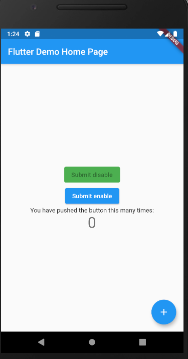
In demo code, disabled color is green
code snippet
    ElevatedButton(
      onPressed: null,
      child: Text('Submit disable'),
      style: ButtonStyle(
        backgroundColor: MaterialStateProperty.resolveWith<Color>(
          (Set<MaterialState> states) {
            if (states.contains(MaterialState.pressed))
              return Theme.of(context)
                  .colorScheme
                  .primary
                  .withOpacity(0.5);
            else if (states.contains(MaterialState.disabled))
              return Colors.green;
            return null; // Use the component's default.
          },
        ),
      ),
    ),
working demo
full code
import 'package:flutter/material.dart';

void main() {
  runApp(MyApp());
}

class MyApp extends StatelessWidget {
  @override
  Widget build(BuildContext context) {
    return MaterialApp(
      title: 'Flutter Demo',
      theme: ThemeData(
        primarySwatch: Colors.blue,
        visualDensity: VisualDensity.adaptivePlatformDensity,
      ),
      home: MyHomePage(title: 'Flutter Demo Home Page'),
    );
  }
}

class MyHomePage extends StatefulWidget {
  MyHomePage({Key key, this.title}) : super(key: key);

  final String title;

  @override
  _MyHomePageState createState() => _MyHomePageState();
}

class _MyHomePageState extends State<MyHomePage> {
  int _counter = 0;

  void _incrementCounter() {
    setState(() {
      _counter++;
    });
  }

  @override
  Widget build(BuildContext context) {
    return Scaffold(
      appBar: AppBar(
        title: Text(widget.title),
      ),
      body: Center(
        child: Column(
          mainAxisAlignment: MainAxisAlignment.center,
          children: <Widget>[
            ElevatedButton(
              onPressed: null,
              child: Text('Submit disable'),
              style: ButtonStyle(
                backgroundColor: MaterialStateProperty.resolveWith<Color>(
                  (Set<MaterialState> states) {
                    if (states.contains(MaterialState.pressed))
                      return Theme.of(context)
                          .colorScheme
                          .primary
                          .withOpacity(0.5);
                    else if (states.contains(MaterialState.disabled))
                      return Colors.green;
                    return null; // Use the component's default.
                  },
                ),
              ),
            ),
            ElevatedButton(
              onPressed: () {
                print("clicked");
              },
              child: Text('Submit enable'),
              style: ButtonStyle(
                backgroundColor: MaterialStateProperty.resolveWith<Color>(
                  (Set<MaterialState> states) {
                    if (states.contains(MaterialState.pressed))
                      return Theme.of(context)
                          .colorScheme
                          .primary
                          .withOpacity(0.5);
                    else if (states.contains(MaterialState.disabled))
                      return Colors.green;
                    return null; // Use the component's default./ Use the component's default.
                  },
                ),
              ),
            ),
          ],
        ),
      ),
      floatingActionButton: FloatingActionButton(
        onPressed: _incrementCounter,
        tooltip: 'Increment',
        child: Icon(Icons.add),
      ),
    );
  }
}
A simple solution would be to use onSurface property:
ElevatedButton(
  onPressed: null,
  style: ElevatedButton.styleFrom(
    onSurface: Colors.brown,
  ),
  child: Text('Button'),
)
Try This:
style: ElevatedButton.styleFrom(
                  disabledBackgroundColor:
                      Theme.of(context).primaryColor.withOpacity(.8), // Background Color
                  disabledForegroundColor: Colors.white70, //Text Color
                ),
use onSurface in ElevatedButton.styleFrom
 ElevatedButton(
          style: ElevatedButton.styleFrom(
                   primary: Colors.white,
                   onSurface: Colors.green,
          ),
          child: Text("next"),
          onPressed:null
 )
Use button's style property. It contains backgroundColor of MaterialStateProperty<Color>. There is a constant MaterialState.disabled. I think this is what you need.
https://api.flutter.dev/flutter/material/MaterialStateProperty-class.html
I created some code to handle disabledText and disabledColor for both FlatButton and RaisedButton with the new TextButton and ElevatedButton widgets.
This gist is here (I couldn't get dartpad to recognize the gist... but you can copy and paste it there directly and it works... it just won't link) https://gist.github.com/wterrill/7942b4bf5d74a8b2ace952ebf213fe5d
And here's the code itself if you want to copy and paste from here:
import 'package:flutter/material.dart';

void main() => runApp(MyApp());

class MyApp extends StatelessWidget {
  @override
  Widget build(BuildContext context) {
    final bool disableButton = true; // <-- Change this to see buttons disabled
    return MaterialApp(
      title: 'Flutter Demo',
      debugShowCheckedModeBanner: false,
      theme: ThemeData(
        primarySwatch: Colors.blue,
      ),
      home: Scaffold(
        body: Center(
          child: Column(
            mainAxisAlignment: MainAxisAlignment.center,
            children: [
              FlatButton(
                  child: Text("FlatButton"),
                  onPressed: disableButton
                      ? null
                      : () {
                          print("FlatButton normal");
                        },
                  color: Colors.green,
                  shape: RoundedRectangleBorder(
                      borderRadius: BorderRadius.all(
                        Radius.circular(50),
                      ),
                      side: BorderSide(color: Colors.purple, width: 3.0)),
                  disabledColor: Colors.grey,
                  disabledTextColor: Colors.pink),
              SizedBox(height: 25),
              FlatButtonX(
                  childx: Text("TextButton"),
                  onPressedx: disableButton
                      ? null
                      : () {
                          print("FlatButtonX (TextButton)");
                        },
                  colorx: Colors.green,
                  textColorx: Colors.black,
                  shapex: RoundedRectangleBorder(
                      borderRadius: BorderRadius.all(
                        Radius.circular(50),
                      ),
                      side: BorderSide(color: Colors.purple, width: 3.0)),
                  disabledColorx: Colors.grey,
                  disabledTextColorx: Colors.pink),
              SizedBox(height: 100),
              RaisedButton(
                child: Text('RaisedButton'),
                color: Colors.green,
                textColor: Colors.black,
                onPressed: disableButton
                      ? null
                      : () {
                          print("RaisedButton normal");
                        },
                shape: RoundedRectangleBorder(
                      borderRadius: BorderRadius.all(
                        Radius.circular(50),
                      ),
                      side: BorderSide(color: Colors.purple, width: 3.0)),
                disabledColor: Colors.grey,
                  disabledTextColor: Colors.pink,
              ),
              SizedBox(height: 25),
              RaisedButtonX(
                childx: Text('ElevatedButton'),
                colorx: Colors.green,
                textColorx: Colors.black,
                onPressedx:disableButton
                      ? null
                      : () {
                          print("RaisedButtonX (ElevatedButton)");
                        },
                shapex: RoundedRectangleBorder(
                      borderRadius: BorderRadius.all(
                        Radius.circular(50),
                      ),
                      side: BorderSide(color: Colors.purple, width: 3.0)),
                                  disabledColorx: Colors.grey,
                  disabledTextColorx: Colors.pink,
              )
            ],
          ),
        ),
      ),
    );
  }
}

Widget FlatButtonX(
    {Color colorx,
    @required Widget childx,
    RoundedRectangleBorder shapex,
    @required Function onPressedx,
    Key keyx,
    Color disabledColorx,
    Color disabledTextColorx,
    Color textColorx}) {
  if (disabledTextColorx == null && textColorx == null) {
    disabledTextColorx = colorx;
  }
  if (textColorx == null) {
    textColorx = colorx;
  }
  return TextButton(
      key: keyx,
      style: ButtonStyle(
        foregroundColor: MaterialStateProperty.resolveWith<Color>(
          // text color
          (Set<MaterialState> states) => states.contains(MaterialState.disabled)
              ? disabledTextColorx
              : textColorx,
        ),
        backgroundColor: MaterialStateProperty.resolveWith<Color>(
          // background color    this is color:
          (Set<MaterialState> states) =>
              states.contains(MaterialState.disabled) ? disabledColorx : colorx,
        ),
        shape: MaterialStateProperty.all(shapex),
      ),
      onPressed: onPressedx as void Function(),
      child: Padding(
          padding: const EdgeInsets.symmetric(horizontal: 8.0), child: childx));
}

Widget RaisedButtonX(
    {Color colorx,
    @required Widget childx,
    RoundedRectangleBorder shapex,
    @required Function onPressedx,
    Key keyx,
    Color disabledColorx,
    Color disabledTextColorx,
    Color textColorx}) {
  if (disabledTextColorx == null && textColorx == null) {
    disabledTextColorx = colorx;
  }
  if (textColorx == null) {
    textColorx = colorx;
  }
  return ElevatedButton(
      key: keyx,
      style: ButtonStyle(
        foregroundColor: MaterialStateProperty.resolveWith<Color>(
          // text color
          (Set<MaterialState> states) => states.contains(MaterialState.disabled)
              ? disabledTextColorx
              : textColorx,
        ),
        backgroundColor: MaterialStateProperty.resolveWith<Color>(
          // background color    this is color:
          (Set<MaterialState> states) =>
              states.contains(MaterialState.disabled) ? disabledColorx : colorx,
        ),
        shape: MaterialStateProperty.all(shapex),
      ),
      onPressed: onPressedx as void Function(),
      child: childx);
}
Because the original disabled color has opacity you can simply wrap it in a container and give the container the color you want. It's a bit hacky but it works and is fast done. Especialy if you have many buttons with different colors.
The cleanest way would be a custom button widget where you can handover the parameters you need.
Container(
        decoration: BoxDecoration(
          borderRadius: BorderRadius.all(const Radius.circular(radius)),
          color: containerColor,
        ),
        width: containerWidth,
        height: containerHeight,
        child: ElevatedButton(
          onPressed: bool ? onPressed : null,
          child: Text(
            buttonText,
          ),
        ),
      ),
Make all variables nullable which are not allways needed.