3

I have a font display problem while using gvim in Windows 7 with the Terminus font. Here's a sample:

1x enter image description here
3x enter image description here

I'm pretty sure it's trying to display casesensitive in bold, but Terminus.ttf is meant to be displayed with no anti-aliasing or hinting.

Even after removing every reference to "bold" from my colorscheme file, it still looks like this. Turning ClearType off makes it look worse. If it matters, my colorscheme is zenburn.

What could be causing this, and how can I fix it? Thanks!
grzuy
  • 4,791
  • 2
  • 20
  • 17
mwcz
  • 8,949
  • 10
  • 42
  • 63

2 Answers2

3

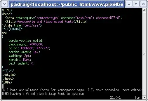
I'm not sure this is an answer, but I cannot tolerate TrueType fonts in gvim when I'm working on Windows (or any other code editor on Windows, I suppose). I opt immediately for the bitmap fonts supplied by Linux/X11, in particular the miscfixed font set. They are far far more readable than any TTF font I've encountered, and are crisp & readable even at extremely small sizes (like 6px). They are completely immune to any font-smoothing or hinting monkey-business.

Here's a picture I lifted from someone's blog post:

Illustration of the miscfixed font

I am not certain of a download location for the font set, but when on Windows I have typically installed the Cygwin environment and just copied the fonts from Cygwin to the Windows fonts directory.

Note: There is a TTF implementation of this font out there somewhere, but it looks terrible, especially when ClearType is on. The true bitmap font is the way to go.

Michael Berkowski
  • 267,341
  • 46
  • 444
  • 390
  • I found a bitmap version of the font in question. Thanks for pointing me in the right direction. Gvim is still trying to 'bold' the font even though I have removed all references to 'bold' from my colorscheme file, but my question was about hinting, so enjoy the points. :) – mwcz Jul 06 '11 at 03:34
  • 1
    @mwcz Happy to help & sing the praises of bitmap fonts. Regarding the bold issue - I had the same problem (detest bold fonts) and solved it by adding explicitly adding `gui=none` to the end of every line in my colorscheme file. – Michael Berkowski Jul 06 '11 at 10:44
1

Does this problem only show up with that font? Have you considered an alternate one? Anonymous is a really good alternative.

Cyber Oliveira
  • 8,178
  • 4
  • 28
  • 18
  • I don't have any other fonts on-hand that aren't supposed to have anti-aliasing. I'll try out Anonymous, it looks cool and I like trying out new fonts. Thanks for the suggestion. – mwcz Jun 29 '11 at 15:11