I have tried so much to build this bottomNavigationBar with the curve and space between icons. Cannot figure it out.
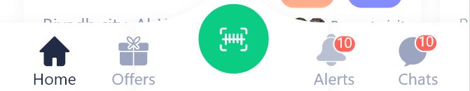
I have tried so much to build this bottomNavigationBar with the curve and space between icons. Cannot figure it out.
 floatingActionButtonLocation: FloatingActionButtonLocation.centerDocked,
      floatingActionButton: FloatingActionButton(
        onPressed: () {},
        child: Icon(Icons.add),
        elevation: 2.0,
      ),
      bottomNavigationBar: BottomAppBar(
        clipBehavior: Clip.antiAlias,
        notchMargin: 5,
        shape: CircularNotchedRectangle(),
        child: Wrap(
          children: [
            BottomNavigationBar(
              type: BottomNavigationBarType.fixed,
              currentIndex: 0,
              onTap: (int index) {},
              items: [
                BottomNavigationBarItem(icon: Icon(Icons.radio), label: 'A'),
                BottomNavigationBarItem(icon: Icon(Icons.radio), label: 'A'),
                BottomNavigationBarItem(icon: Icon(Icons.radio), label: 'A'),
                BottomNavigationBarItem(icon: Icon(Icons.radio), label: 'A'),
              ],
            ),
          ],
        ),
      ),

Check this code.
Have a look at this package: convex_bottom_bar.
The notch shape can be customized by writing a class that extending NotchedShape and implementing getOuterPath that contains the logic for the notch curve. Check this out to know exact implementation convex_shape.dart
To have a green icon at the bottom:
import 'package:convex_bottom_bar/convex_bottom_bar.dart';

Scaffold(
  bottomNavigationBar: ConvexAppBar(
    items: [
      TabItem(icon: Icons.home, title: 'Left'),
      TabItem(icon: new Icon(Icons.add, color: Colors.green,), activeIcon: new Icon(Icons.add, color: Colors.green,) title: 'Middle'),
      TabItem(icon: Icons.message, title: 'Right'),
    ],
    initialActiveIndex: 2,//optional, default as 0
    onTap: (int i) => print('click index=$i'),
  )
);