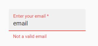
Does PrimeNg have something equivalent to mat-error from Angular Material?
 <mat-form-field appearance="fill">
    <mat-label>Enter your email</mat-label>
    <input matInput placeholder="pat@example.com" [formControl]="email" required>
    <mat-error *ngIf="email.invalid">{{getErrorMessage()}}</mat-error>
  </mat-form-field>
I have some data bounded to a NgModel and when the user presses a button I want to validate that Input and display some error messages(below the input field) in case of invalid input. I m aware of the form builders and their predefined validator but I want to use FluentValidator(https://www.npmjs.com/package/fluentvalidation-ts) this time.
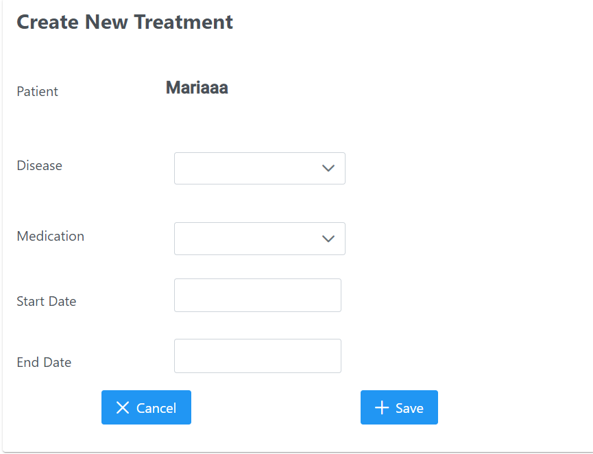
<p-card header="Create New Treatment " [style]="{'width':'45%', 'margin-left':'auto','margin-right':'auto','margin-top':'5%'}">


    <!--comments  -->
      <div style="margin-left: auto;margin-right: auto;">
    <div class="p-field p-grid">
      <label for="firstname3" class="p-col-fixed" style="width:100px">Patient</label>
      <div class="p-col" style="margin-top: 4%; margin-left: 11%;">
        <h2><strong style="margin-top: 10%;">{{patientName}}</strong></h2>

      </div>
    </div>

    <div class="p-field p-grid">
      <label for="firstname3" class="p-col-fixed" style="width:100px">Disease</label>
      <div class="p-col">
        <p-dropdown [style]="{'width':'200px'}" [options]="diseaseOptions"
          [(ngModel)]="selectedDiseaseId"></p-dropdown>

      </div>
    </div>

    <div class="p-field p-grid">
      <label for="firstname3" class="p-col-fixed" style="width:100px">Medication</label>
      <div class="p-col">
        <p-dropdown  [style]="{'width':'200px'}" [options]="medicationOptions"
          [(ngModel)]="selectedMedicationId"></p-dropdown>

      </div>
    </div>

    <div class="p-field p-grid">
      <label for="firstname3" class="p-col-fixed" style="width:100px">Start Date</label>
      <div class="p-col">
        <p-calendar  [style]="{'margin-left':'15%' ,'margin-top':'2%'}" [(ngModel)]="endDate" showButtonBar="true"
          inputId="buttonbar1"></p-calendar>
      </div>
    </div>


    <div class="p-field p-grid">
      <label for="firstname3" class="p-col-fixed" style="width:100px">End Date</label>
      <div class="p-col">
        <p-calendar [style]="{'margin-left':'15%' ,'margin-top':'2%'}" [(ngModel)]="startDate" showButtonBar="true"
          inputId="buttonbar2"></p-calendar>
      </div>
    </div>
  </div>
  <button type="button" [routerLink]='["/patients"]' style="margin-left:15%"  pButton icon="pi pi-times" label="Cancel"> </button>
  <button type="button" style="margin-left:30%" (click)="createTreatment()" pButton icon="pi pi-plus" label="Save"> </button>


  </p-card>