55

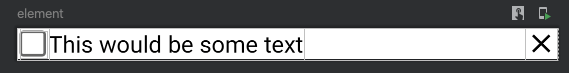
I've been trying to achieve the following layout with compose:

enter image description here

For this, I've created the composable:

@Preview(showBackground = true)
@Composable
fun element() {
    ConstraintLayout(
        modifier = Modifier.fillMaxWidth()
    ) {
        val (checkbox, title, icon) = createRefs()

        Text(
            text = "This would be some text",
            style = TextStyle(
                color = Color.Black,
                fontSize = 18.sp,
            ),
            modifier = Modifier.constrainAs(title) {
                top.linkTo(parent.top)
                bottom.linkTo(parent.bottom)
                start.linkTo(checkbox.end)
                end.linkTo(icon.start)
            },
        )

        Checkbox(
            checked = false,
            modifier = Modifier.constrainAs(checkbox) {
                top.linkTo(title.top)
                bottom.linkTo(title.bottom)
                start.linkTo(parent.start)
            },
            onCheckedChange = {},
        )

        Icon(
            asset = Icons.Filled.Close,
            modifier = Modifier
                .constrainAs(icon) {
                    top.linkTo(title.top)
                    bottom.linkTo(title.bottom)
                    end.linkTo(parent.end)
                }
        )
    }
}

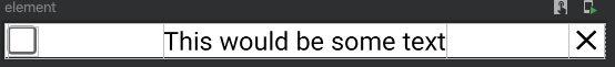
However, the text composable does not fill the entire space and the UI looks like: enter image description here

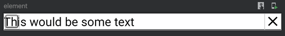
I've tried adding modifiers to the Text composable like Modifier..fillMaxWidth(), but this results in:

enter image description here

I've tried also to use a constraint set with a horizontal chain, but to no avail. I know that removing end.linkTo(icon.start) would look like this is achievable, but when the text would be really long it would overlap with the delete icon.

What am I missing here? How do I achieve the same result as in the view system when we say the TextView's width is 0dp?

Vadim Kotov
  • 8,084
  • 8
  • 48
  • 62
Fred
  • 16,367
  • 6
  • 50
  • 65

1 Answers1

117

Use Dimension.fillToConstraints:

A Dimension that spreads to match constraints. Links should be specified from both sides corresponding to this dimension, in order for this to work.

Add this line to your Text modifier:

width = Dimension.fillToConstraints

So it becomes:

Text(
    text = "This would be some text",
    style = TextStyle(
        color = Color.Black,
        fontSize = 18.sp,
    ),
    modifier = Modifier.constrainAs(title) {
        top.linkTo(parent.top)
        bottom.linkTo(parent.bottom)
        start.linkTo(checkbox.end)
        end.linkTo(icon.start)
        width = Dimension.fillToConstraints
    },
)
Saurabh Thorat
  • 18,131
  • 5
  • 53
  • 70
  • 1
    Very nice! One follow up question, do you have a link where this is explained? thanks! – Fred Oct 12 '20 at 13:53
  • 3
    It's there in a [compose codelab](https://codelabs.developers.google.com/codelabs/jetpack-compose-layouts/#8) under the section "Customizing dimensions" – Saurabh Thorat Oct 12 '20 at 14:30
  • you need the dependency `implementation "androidx.constraintlayout:constraintlayout-compose:1.0.0-rc02"` see https://developer.android.com/jetpack/compose/layouts/constraintlayout#0 – lineage Dec 27 '21 at 18:29
  • @SaurabhThorat is there any way to add double condition, for instance : width = Dimension.fillToConstraints when the text is small and width = Dimension.wrapContent when the text is large? – Skizo-ozᴉʞS ツ Mar 16 '22 at 12:49
  • this does not work now – Talha Akbar May 24 '22 at 11:08
  • I cant find the constrainAs in the version"androidx.constraintlayout:constraintlayout-compose:1.0.1". does anybody know if it has been replaced with something else? – Mateo Hervas Feb 03 '23 at 18:09
  • It's perfectly! – Ven Shine Apr 20 '23 at 03:43