Here is the CSS animation I am playing:
#mydiv{
  width: 700px;
  height: 100px;
  border-radius: 50px;
  background-color: rgb(20, 20, 20);
  position: relative;
  overflow: hidden;
  top: 50px;
}

#mydiv:before{
  content: "";
  width: 20%;
  height: 100px;
  border-radius: 50px;
  background-color: rgb(255, 174, 0);
  position: absolute;
  overflow: hidden;
  animation: loading 2s infinite;
}

@keyframes loading{
  from{
    transform: translateX(-100%);
  }
  to{
    transform: translateX(500%);
  }
}
<div id="mydiv">
</div>It should show the yellow part with rounded edges moving inside the black div from left to right. But here is how I am seeing it in my Google Chrome browser:
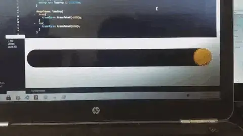
You can clearly notice that the right side of the yellow part isn't round throughout the whole animation, it's breaking. I tested this animation in Firefox and Edge in my pc and also on Chrome of another pc and it was showing without any bug in those browsers. I am facing this problem in Chrome of my pc only. When I tried to take a screenshot of the broken border-radius of the yellow part, it was showing correctly in the screenshot. Then I recorded my screen, and when I played the recorded video, the animation was looking bugless there too, I don't know why. So, I had to record this in my mobile, convert it into a gif and post it here.
What could be the reason for this behaviour of my Google Chrome? What is the fix for this?
UPD1: I was investigating this issue using chrome dev tools, and noticed that the bug goes away instantly when I enable Paint Flashing, and it appears again if I disable it.
UPD2: The bug also goes away when I inspect anything of that page in chrome dev tools, it appears again when I stop inspecting.