1

I using Apache Echarts and have an issue using type: 'value' works in case of X-axis.

My code: You can try here

option = {
xAxis: {
    type: 'value',
    data: [1.12, 2.19, 3.84, 3.47, 5.75, 6.76, 9.141],
},
yAxis: {
    type: 'value'
},
series: [{
    data: [820, 932, 901, 934, 1290, 1330, 1320],
    type: 'line'
}]

};

According to the documentation of the API,

xAxis. type

'category' Category axis, suitable for discrete category data.

'value' Numerical axis, suitable for continuous data.

X-axis type: documentation

When I use 'category' as the type: for x-axis it gives me the curve as expected but the x-axis isn't evenly spaced.

Expected curve type with improper x-axis spacing corresponding to values

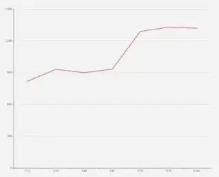
But I have to plot about 10,000 points of continuous data from the sensors as in the data for x-axis. The API suggests to use xAxis.type: 'value' for such data. When I set the xAxis.type: 'value', the render looks like this.

Unexpected result

It would be great if someone could help me out and tell me where I am going wrong or if this is an actual bug.

JMP
  • 4,417
  • 17
  • 30
  • 41

1 Answers1

4

When both the axis types are value, the data should be in the following format so that the x and y values are mapped properly.

data = [
        [1.12,820],
        [2.19, 932],
        [3.84, 901], //xaxis value is not in order
        [3.47,934], //xaxis value is not in order
        [5.75,1290],
        [6.76,1330], 
        [9.141,1320]
    ];

If the axis values are not in order, you can sort them to display accordingly.

//sort data by xaxis values to plot the values in order
data.sort(function(a, b){return a[0] - b[0]}) 

Then set the data to the chart

option = {
        xAxis: {
            type: 'value',
        },
        yAxis: {
            type: 'value'
        },
        series: [{
            data: data,
            type: 'line'
        }]
    };

Echarts with value type axis

Narayanan Ramanathan
  • 1,310
  • 10
  • 18
  • Thanks, it is working as expected, also if user data is not staring from 0 in any of the axis then add attribute 'scale': true to that particular axis configuration object (xAxis/yAxis configuration object ) and it will show axis staring and ending from your given data start point and end point. for reference: https://echarts.apache.org/en/option.html#xAxis.scale – Prem popatia Aug 25 '21 at 14:22
  • how to add multiple lines in Y axis? – Zhaolin Feng Apr 18 '23 at 09:43