3

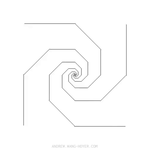
I am trying to recreate the following animation:

enter image description here

I am having trouble with getting a line to properly animate around corners. I've tried using an animateMotion-element like so:

<line class="testLine" x1="10" y1="10" x2="100" y2="10" stroke="white"> 
        <animateMotion dur="1.6s" repeatCount="indefinite" 
            path="M 10 10 L 390 10
             M 390 10 L 390 290
             M 390 290 L 10 290
             M 10 290 L 10 10"> 
        </animateMotion>
</line> 

But the line is not smoothly rounding corners. Any idea on how to get it to make it move smoothly around corners as shown in the GIF?

Alexandr_TT
  • 13,635
  • 3
  • 27
  • 54
HaakonFlaar
  • 387
  • 2
  • 4
  • 15
  • 2
    Please read about [How SVG Line Animation Works](https://css-tricks.com/svg-line-animation-works/) – enxaneta Sep 22 '20 at 18:40

3 Answers3

3

You will need to create a path with srtoke-dasharray = 1/2 of the side of the rect and animate the stroke-dashoffset of the path to 0

Please read the comments in the code:

const SVG_NS = "http://www.w3.org/2000/svg";
let sz = 50;//initial size 1/2 rect side
//the array of the paths. Inside the array uou have a first object for the path #p
let sqRy = [{ s: sz, d: "", l: p.getTotalLength(), el: p }];

//create several paths and rotate those paths accordingly
for (let i = 1; i < 8; i++) {
  let o = {};
  let size = sqRy[i - 1].s / 2;
  
  o.s = Math.sqrt(2 * size * size);
  //the value od the d attribute of the new path
  o.d = `M-${o.s},-${o.s}L${o.s},-${o.s} ${o.s},${o.s} -${o.s},${o.s} -${o.s},-${o.s}z`;

  o.el = document.createElementNS(SVG_NS, "path");
  o.el.setAttribute("d", o.d);//set the d attribute
  o.el.setAttribute("transform", `rotate(${45 * i})`);//set the rotation
  svg.appendChild(o.el);//append the new path to the svg element
  o.l = o.el.getTotalLength();//calculate the total length of the new path
  //push the object for the path to the array
  sqRy.push(o);
}


//for every element in the array set the stroke-dasharray and the stroke-dashoffset.
sqRy.map((sq) => {
  sq.el.setAttribute("style", `stroke-dasharray:${sq.s};stroke-dashoffset:${sq.l}`);
});
svg{fill:none;stroke:black;}

path{
     animation: dash 16s linear infinite;
}

@keyframes dash {
  to {
    stroke-dashoffset: 0;
  }
}
<svg width="300" viewBox="-60 -60 120 120" id="svg">
  <path id="p" d="M-50,-50L50,-50 50,50 -50,50 -50,-50z" />  
</svg>
enxaneta
  • 31,608
  • 5
  • 29
  • 42
  • I think you can do the same thing with css keyframes, or no? – Greg-- Sep 23 '20 at 16:06
  • @Greg-- but I'm dooing it with css keyframes – enxaneta Sep 23 '20 at 16:17
  • I talk about without any js - draw full svg without js and then animate with css – Greg-- Sep 23 '20 at 16:25
  • 1
    @Greg-- If you take a look at the js you'll see that you need some way to calculate the size of the squares so that they fit perfectly one inside another. Once you have them you need a way to calculate the length of each path and the value of the strokes and the gaps for the dash array. You can't all this with css – enxaneta Sep 23 '20 at 16:37
2

Same thing just scale rotate and square's diaginal multiplier - sqrt(2)

document.querySelector('svg').innerHTML = [...Array(11)]
  .map((_, i) => Math.pow(2, i/2))
  .map((s, i) => `
    <path transform="scale(${s})rotate(${i*45})" 
          stroke-width="${2/s}" 
          d="m5,5h-10v-10h10z"></path>
`).join(',');
path {
  stroke-dasharray: 5 5;
  fill: none;
  stroke: black;
  animation: shift 3s infinite linear;
}

@keyframes shift {
  100% {stroke-dashoffset: -20}
}
<svg viewBox='-200,-200,400,400' width="90vw" height="90vh"></svg>
Stranger in the Q
  • 3,668
  • 2
  • 21
  • 26
1

Not a calculated one but by aligning svg rectangle(prefer svg path) using svg attribute transform and making use of css stroke-dasharray and stroke-offset for animating, the result can be obtained

if js is not an option then you can just add and align the rectangles you need

CODE

   svg>rect {
            stroke-dasharray: 100;
            -webkit-animation: draw 5s infinite linear;
            /* Chrome, Safari, Opera */
            animation: draw 5s infinite linear;
        }
        
        @keyframes draw {
            to {
                stroke-dashoffset: 1000;
            }
        }
        
        @-moz-keyframes draw {
            to {
                stroke-dashoffset: 1000;
            }
        }
        
        @-webkit-keyframes draw {
            to {
                stroke-dashoffset: 1000;
            }
        }
<svg width="500" height="500">
    <rect width="300" height="300" style="fill:none;stroke-width:2;stroke:black" />
    <rect width="210" height="210" transform='translate(150 1) rotate(45)' style="fill:none;stroke-width:2;stroke:black" />
    <rect width="150" height="150" transform='translate(75 75)' style="fill:none;stroke-width:2;stroke:black" />
  </svg>
stannars jose
  • 261
  • 2
  • 8