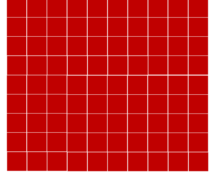
I am working on a dynamic image grid, and I cannot get the grid to stay in a container. The idea is rather simple, add as many boxes to the container as I like, using jQuery, and as they are added, shrink them to fit the container without adding scroll bars, or running off the screen. This is working with adding columns but when adding rows it just keep running off the bottom of the screen.
How do I fix the container div so as rows are added, the image shrinks instead of adding rows with scrollbars?
function GenerateGrid(rows, cols) {
// Get the available space of the container.
var gridContainerH = $('#container').height();
var gridContainerW = $('#container').width();
// Adjust the image size to fit in the available space.
var imageWidth = gridContainerW / cols;
var imageHeight = gridContainerH / rows;
const container = document.getElementById("container");
var img = document.createElement("img");
img.src = "panel.jpg";
container.style.setProperty('--grid-rows', rows);
container.style.setProperty('--grid-cols', cols);
for (i = 0; i < (rows * cols); i++) {
let cell = document.createElement("div");
cell.innerHTML = '<img src=box.jpg width=' + imageWidth + ' height=' + imageHeight + '>';
container.appendChild(cell).className = "grid-item";
};
// Recalculate height
var panelHeight = imageWidth * rows;
$('#container').height(panelHeight);
$('#gridContainer').height(panelHeight);
};
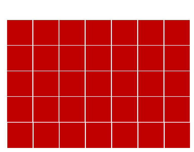
// Start with a 5x7 grid
$(window).on("load", function() {
GenerateGrid(5, 7);
})
// If the column amount changes, rebuild the grid.
$('#columns').change(function() {
var columns = $("#columns").val();
var rows = $("#rows").val();
$('#container').empty();
GenerateGrid(rows, columns);
});
// If the row amount changes, rebuild the grid.
$('#rows').change(function() {
var columns = $("#columns").val();
var rows = $("#rows").val();
$('#container').empty();
GenerateGrid(rows, columns);
});:root {
--grid-cols: 1;
--grid-rows: 1;
}
#container {
display: grid;
grid-gap: 0em;
grid-template-rows: repeat(var(--grid-rows), 0fr);
grid-template-columns: repeat(var(--grid-cols), 0fr);
}
#gridContainer {
width: 768px;
height: 600px;
max-height: 600px;
}
#staticContainer {
width: 768px;
height: 600px;
max-height: 600px;
}
.grid-item {
padding: 0em;
text-align: center;
}<link href="https://cdnjs.cloudflare.com/ajax/libs/twitter-bootstrap/4.5.0/css/bootstrap.min.css" rel="stylesheet"/>
<script src="https://cdnjs.cloudflare.com/ajax/libs/jquery/3.3.1/jquery.min.js"></script>
<div class="container-fluid">
<div class="row">
<div class="col-lg-2">
<form>
<label for="columns">Columns</label>
<input type="number" id="columns" name="columns" value="7">
<label for="rows">Rows</label>
<input type="number" id="rows" name="rows" value="5">
</form>
</div>
<div class="col-lg-10">
<div class="container" id="gridContainer">
<div class="row">
<div class="col-lg-8 text-center">
Horizontal label
</div>
</div>
<div class="row h-100">
<div class="col-lg-1 my-auto">
Vertical label
</div>
<div class="col-lg-7 staticContainer">
<div id="container"></div>
</div>
<div class="col-lg-4 mt-auto">
Right Side
</div>
</div>
</div>
</div>
</div>
</div>What is involved with creating a Div container for the grid that will not grow beyond defined width and height?
Edit: Please see the images as an example.