If you want that rounded border, you can render it yourself, or easier, subclass MKMarkerAnnotationView rather than MKAnnotationView:
class CustomAnnotationView: MKMarkerAnnotationView {
    override var annotation: MKAnnotation? {
        didSet { configure(for: annotation) }
    }

    override init(annotation: MKAnnotation?, reuseIdentifier: String?) {
        super.init(annotation: annotation, reuseIdentifier: reuseIdentifier)

        glyphImage = ...
        markerTintColor = ...

        configure(for: annotation)
    }

    required init?(coder aDecoder: NSCoder) {
        fatalError("init(coder:) has not been implemented")
    }

    func configure(for annotation: MKAnnotation?) {
        displayPriority = .required

        // if doing clustering, also add
        // clusteringIdentifier = ...
    }
}
That way, not only do you get the circular border, but you get all of the marker annotation view behaviors (shows the title of the annotation view below the marker, if you select on the marker annotation view, it becomes larger, etc.). There’s a lot of marker annotation view behaviors that you probably don’t want to have to write from scratch if you don’t have to. By subclassing MKMarkerAnnotationView instead of the vanilla MKAnnotationView, you get all those behaviors for free.
For example, you could:
class CustomAnnotationView: MKMarkerAnnotationView {
    static let glyphImage: UIImage = {
        let rect = CGRect(origin: .zero, size: CGSize(width: 40, height: 40))
        return UIGraphicsImageRenderer(bounds: rect).image { _ in
            let radius: CGFloat = 11
            let offset: CGFloat = 7
            let insetY: CGFloat = 5
            let center = CGPoint(x: rect.midX, y: rect.maxY - radius - insetY)
            let path = UIBezierPath(arcCenter: center, radius: radius, startAngle: 0, endAngle: .pi, clockwise: true)
            path.addQuadCurve(to: CGPoint(x: rect.midX, y: rect.minY + insetY), controlPoint: CGPoint(x: rect.midX - radius, y: center.y - offset))
            path.addQuadCurve(to: CGPoint(x: rect.midX + radius, y: center.y), controlPoint: CGPoint(x: rect.midX + radius, y: center.y - offset))
            path.close()
            UIColor.white.setFill()
            path.fill()
        }
    }()

    override var annotation: MKAnnotation? {
        didSet { configure(for: annotation) }
    }

    override init(annotation: MKAnnotation?, reuseIdentifier: String?) {
        super.init(annotation: annotation, reuseIdentifier: reuseIdentifier)

        glyphImage = Self.glyphImage
        markerTintColor = #colorLiteral(red: 0.005868499167, green: 0.5166643262, blue: 0.9889912009, alpha: 1)

        configure(for: annotation)
    }

    required init?(coder aDecoder: NSCoder) {
        fatalError("init(coder:) has not been implemented")
    }

    func configure(for annotation: MKAnnotation?) {
        displayPriority = .required

        // if doing clustering, also add
        // clusteringIdentifier = ...
    }
}
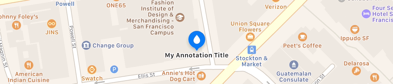
That yields:

Obviously, when you set glyphImage, set it to whatever image you want. The old SF Symbols doesn't have that “drop” image (though iOS 14 has drop.fill). But supply whatever 40 × 40 pt image view you want. I'm rendering it myself, but you can use whatever appropriately sized image from your asset catalog (or from the system symbols) that you want.
As an aside, since iOS 11, you wouldn't generally wouldn't implement mapView(_:viewFor:) at all, unless absolutely necessary (which it isn't in this case). For example, you can get rid of your viewFor method and just register your custom annotation view in viewDidLoad:
override func viewDidLoad() {
    super.viewDidLoad()

    mapView.register(CustomAnnotationView.self, forAnnotationViewWithReuseIdentifier: MKMapViewDefaultAnnotationViewReuseIdentifier)

    ...
}

