I made an appliaction in React and used the library Grommet to design my components. I defined a theme file to set breakpoints for different mobile devices:
const customBreakpoints = deepMerge(grommet, {
  global: {
    breakpoints: {
      small: {
        value: 768,
        borderSize: {
          xsmall: "1px",
          small: "2px",
          medium: "4px",
          large: "6px",
          xlarge: "12px"
        },
        edgeSize: {
          none: "0px",
          hair: "1px",
          xxsmall: "2px",
          xsmall: "3px",
          small: "6px",
          medium: "12px",
          large: "24px",
          xlarge: "48px"
        },
        size: {
          xxsmall: "24px",
          xsmall: "48px",
          small: "96px",
          medium: "192px",
          large: "384px",
          xlarge: "768px",
          full: "100%"
        }
      },
      medium: { value: 1536 },
      large: {}
    }
  }
});
To layout the buttons I used grommets Box component:
const App = () => (
  <Grommet theme={customBreakpoints}>
    <ResponsiveContext.Consumer>
      {size => (
        <div>
          <Box
            direction="column"
            align="center"
            gap="medium"
            pad="small"
            overflow={{
              horizontal: "auto"
            }}
          >
            <Button
              primary
              hoverIndicator="true"
              style={{
                width: "100%"
              }}
              label="Next"
            />
            <Box width="medium" direction="row-responsive">
              <Button
                primary
                icon={<DocumentPdf color="white" />}
                style={{
                  boxSizing: "border-box",
                  background: "red",
                  height: "38px",
                  lineHeight: "24px",
                  fontSize: "18px",
                  fontWeight: 600,
                  paddingLeft: "20px",
                  paddingRight: "20px"
                }}
                label="Export PDF"
              />

              <Button
                primary
                icon={<DocumentPdf color="white" />}
                style={{
                  boxSizing: "border-box",
                  background: "red",
                  height: "38px",
                  lineHeight: "24px",
                  fontSize: "18px",
                  fontWeight: 600,
                  paddingLeft: "20px",
                  paddingRight: "20px"
                }}
                label="Export all"
              />
            </Box>
          </Box>
        </div>
      )}
    </ResponsiveContext.Consumer>
  </Grommet>
);

const rootElement = document.getElementById("root");
ReactDOM.render(<App />, rootElement);
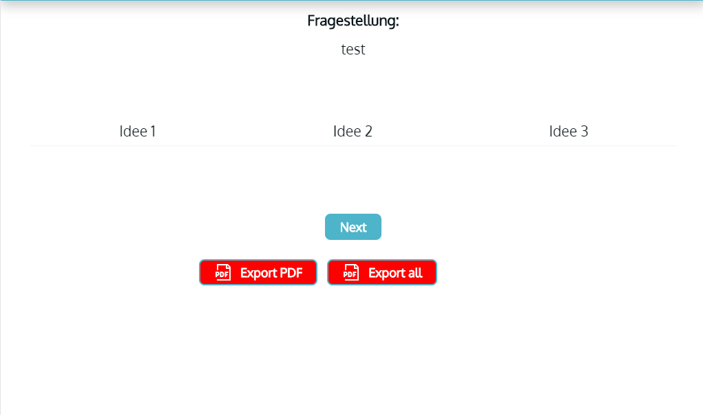
When I run the application and inspect my current window on different devices I get the following output:
and
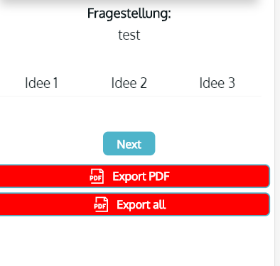
Even with ResponsiveContext.Consumer and setting the width=size} it didn´t work.
Any suggestions?
I made a Sandbox example.