I have a p-dropdown component on my App. Its' configured like this:
  <p-dropdown
                 [showTransitionOptions]="'0ms'"
                 [hideTransitionOptions]="'0ms'"
                 dropdownIcon="fa fa-angle-down"
                (onChange)="onChangePrimaryTarget($event)"
                 [options]="targetsLookup"
                 formControlName="target"
                 placeholder="Select a Primary Target"
                 tooltip="'getTargetDescription($event)'">
</p-dropdown>
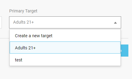
I need to show the description for each target on Hover I read the PrimeNg documentation and says that the tooltip configuration does that. The problem is that I'm not seing anything:
What I need to see is something like this:
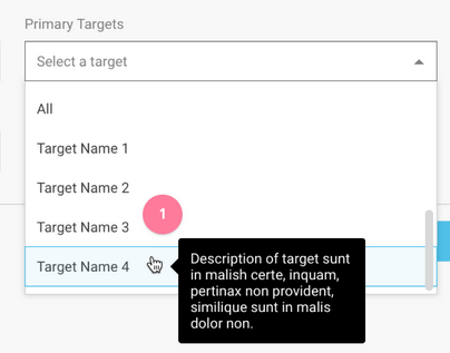
With the black tooltip on hover.
I already tried to hardcode some text on the tooltip and still doesn't show anything.
What I'm missing here?