1

I'm facing trouble understanding what's going on. The problem is with the <a> tag to which I've set some padding and radius to make it like a button. But I see it overflows the container like this-

enter image description here

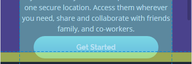
It seems like the container sets its boundary immediately after get started text. So I want to know why does the <a>'s padding overflow the container?

Here's react component-

JSX-

const topSection = ()=> {
    return (
        <section className="top-section">
            <img className="img-intro" src="./images/illustration-intro.png" alt="illustration-img"/>
            <h1>All your files in one secure location, accessible anywhere.</h1>

            <p>Fylo stores all your most important files in one secure location. Access them wherever 
            you need, share and collaborate with friends family, and co-workers.</p>

            <a href="/">Get Started</a>          //ISSUES WITH THIS ONE
        </section>
    )
}

SASS-

@import "../../colors.scss";

.top-section {
    text-align: center;
    background: url("/images/bg-curvy-mobile.svg") center bottom/150% 75% no-repeat border-box;
    margin-top: 5%;

    img {
        width: 100%;
        margin-bottom: 10%;
    }

    h1, p, a {
        margin-top: 5%;
        margin-bottom: 5%;
    }
    h1 {
        font-size: 1.4rem;
        line-height: 1.5;
    }
    a {
        color: white;
        background: color(get-started);
        padding: 1em 6em;
        border-radius: 2em;
        margin: 10% auto;
    }
}
Sapinder Singh
  • 559
  • 6
  • 21

1 Answers1

1

The issue there is that <a></a> tag is always display: inline by default.

Please try changing it to display: block and work from there.

Wrote some example which is based on yours:

.top-section {
    text-align: center;
    background: url("https://upload.wikimedia.org/wikipedia/commons/c/c3/Aurora_as_seen_by_IMAGE.PNG") center bottom/150% 75% no-repeat border-box;
    margin-top: 5%;
}
.top-section img {
        width: 100%;
        margin-bottom: 10%;
    }

 .top-section h1, p, a {
        margin-top: 5%;
        margin-bottom: 5%;
        color: white;
    }
 .top-section h1 {
        font-size: 1.4rem;
        line-height: 1.5;
    }
 .top-section a {
        color: white;
        background: blue;
        padding: 1em 0;
        border-radius: 2em;
        display: block;
        width: 10em;
        margin: auto;
}
    }
<section class="top-section">
  <img class="img-intro" src="" alt="illustration-img"/>
  <h1>All your files in one secure location, accessible anywhere.</h1>
  <p>Fylo stores all your most important files in one secure location. Access them wherever you need, share and collaborate with friends family, and co-workers.</p>
  <a href="/">Get Started</a>
</section>
Jakub A Suplicki
  • 4,586
  • 1
  • 23
  • 31
  • oh thanks for pointing out. so it means `padding` doesn't affect `inline` items? any elaboration? – Sapinder Singh Jun 17 '20 at 05:26
  • Generally speaking, inline elements behave differently to block elements. In this case, only the left and right padding will have an effect. That is because by default there is no line break attached to it, which means you will be able to see the padding but without line breaks. I think the best way to understand it would be too look here, for example: https://maxdesign.com.au/articles/inline/ – Jakub A Suplicki Jun 17 '20 at 05:43