16

HTML:

<div class="imgcontainer">
    <ul>
            <li><img src="1.jpg" alt="" /></li>
            <li><img src="2.jpg" alt="" /></li>
            .....
    </ul>
</div>  

I'm coding a simple gallery page by creating unordered list and each list item of it contains an image.

    ul li {
        float: left;
    }

I set the width of the container as "max-width" so I can make possible to fit the list items (images) to the browser width.. meaning that they will be re-arranged when the browser window re-sized.

    .imgcontainer{
        max-width: 750px;
    }

Now the problem is those images or list items are not aligned to center, they are aligned to the left of .imgcontainer body (colored gray in the attached link below), leaving a space on the right when the window re-sized!

enter image description here

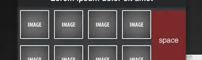
How can I center those images every time the window resized?

Here's the whole page/code you can preview it or edit it at JS Bin

http://jsbin.com/etiso5

Community
  • 1
  • 1
Sam
  • 325
  • 2
  • 3
  • 9
  • 3
    from li remove `float:left;` and add `display:inline-block;` – rubish Jun 04 '11 at 09:39
  • @rubish display:inline-block; definitely seems to be a more robust solution than just 'display:inline;' as given in the accepted answer below. +1 – Phill Healey Nov 03 '14 at 10:10

2 Answers2

21

Remove float:left and use display:inline so that you can use text-align:center. Set the font size to zero so that you don't have white-space between the images.

ul {
    font-size:0;
    text-align:center
}
ul li {
    display:inline;
    zoom:1
}
.imgcontainer {
    max-width:750px;
    margin:0 auto
}

The zoom is a hack for old IE versions. This is however not a valid CSS property, so won't go through the W3C validator.

Midas
  • 7,012
  • 5
  • 34
  • 52
  • @Midas well this works fine, thanks! but is it possible to align the last row items to the left [link](http://cl.ly/7Ja9) , you know, text-align:left will get me the old problem. – Sam Jun 04 '11 at 10:28
  • IE only support `inline-block` on `inline`-elements. You can fix this by adding `zoom:1; *display:inline;` to `ul li`. – Marwelln Jun 04 '11 at 10:57
  • @Midas hummm.. still the same, the last row items still have center alignment, you can check this page (after editing) to see what I'm saying [link](http://jsbin.com/ihuso5) . there's 3 images In the middle, try to resize your window you will notice that you have one image in the middle. how can I make those images in the last row on the left (before and after resizing) and in the meantime still having the image container in the middle. – Sam Jun 04 '11 at 11:14
  • @Sam: I have no idea... My thought was that if you set `text-align:center` on the container and `text-align:left` on the `ul` it would do what you want, but there is a problem that the width of the `ul` is 100% of the container because it is `display:block`. If you set it to `display:inline-block` or `display:inline` it won't allow the images to be next to each other, they will be one per row. You can however fix this by giving a fixed width to your `ul`, but that's not what you want. – Midas Jun 04 '11 at 11:32
  • @Marwelln: Nice one, but that's not W3C valid. By the way `zoom:1; display:inline` (without asterisk) works just fine. – Midas Jun 04 '11 at 11:32
  • @Marwelln: Thanks for the edit. However I removed the `display:inline-block` and the asterisk. Seems to work fine in IE5.5+ and other browsers. See my comment above. – Midas Jun 04 '11 at 16:10
  • My own requirement was slightly different and required display:inline for Chrome and Firefox. To get IE to work properly I used IE conditional comments to create a second stylesheet to manage the zoom, alternate display. – Mr Griever Feb 10 '12 at 19:13
0

This assumes that all items are the same width. If you don't want the last row of items to be centered, you can accomplish this with a few lines of JavaScript. Ditch the inline-block, text-align center stuff, and just float your list elements and put margin: 0 auto on the list container.

On the JS side of things, calculate the width of your content pane or window, next determine how many items you can fit in a row, i.e. the list container element's width, and then set that width. itemWidth here assumes each list item's width + margin + padding + border.

var centerListItems = function (itemWidth) {
  var $paneWidth = $('#my-content').width(),
      setWidth;

  setWidth = parseInt(($paneWidth / itemWidth), 10) * itemWidth;

  $('#my-list').width(setWidth);
}

If you want it to change when the window is resized or orientation is changed, you can use underscore.js to debounce the call.

var event;

if ('onorientationchange' in window) {
  event = 'onorientationchange';
} else {
  event = 'resize';
}

$(window)
  .off(event)
  .on(event, _.debounce(function () {
    centerListItems(itemWidth);
  }, 350));
Ben Zalasky
  • 31
  • 1
  • 7