3

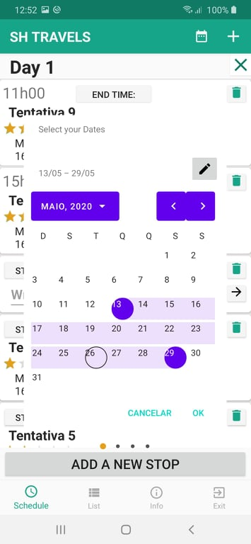
This is my situation, as you can see I have a daterangepicker from the MaterialComponents.DatePicker library. The circle to select the day is off by a lot. Before any of you suggest, I have tried changing the date ranger picker to fullscreen instead of dialog and all the problems remained. This said, if any of you prefer to make the changes in the fullscreen mode, it is fine by me. By the way, the fragment in which the datepicker is called is centered.

The colors I have no idea where he got them from, so if anyone knows where or how to change, please tell me. Plus, the purple color shown there is nowhere to be found in my colors.xml

enter image description here

Now, the code: This is my Datepicker (called by a options menu button):

MaterialDatePicker.Builder dateBuilder = MaterialDatePicker.Builder.dateRangePicker();
                CalendarConstraints.Builder constraintsBuilder = new CalendarConstraints.Builder();
                dateBuilder.setCalendarConstraints(constraintsBuilder.build());
                dateBuilder.setTitleText("Select your Dates");
                dateBuilder.setTheme(R.style.DatePickerTheme);
                MaterialDatePicker<Pair<Long, Long>> datePicker = dateBuilder.build();
                datePicker.addOnCancelListener(new DialogInterface.OnCancelListener() {
                    @Override
                    public void onCancel(DialogInterface dialog) {
                        Log .d("DatePicker Activity", "Dialog was cancelled");
                    }
                });
                datePicker.addOnNegativeButtonClickListener(new View.OnClickListener() {
                    @Override
                    public void onClick(View v) {
                        Log.d("DatePicker Activity", "Dialog Negative Button was clicked");
                    }
                });
                datePicker.addOnPositiveButtonClickListener(new MaterialPickerOnPositiveButtonClickListener<Pair<Long, Long>>() {
                    @Override
                    public void onPositiveButtonClick(Pair<Long, Long> selection) {
                        Log.d("DatePicker Activity", "Date String = ${picker.headerText}::  Date epoch values::${it.first}:: to :: ${it.second}");
                        SharedPreferences sharedPreferences = getActivity().getSharedPreferences("Settings", Context.MODE_PRIVATE);
                        SharedPreferences.Editor sEditor = sharedPreferences.edit();
                        sEditor.putLong("Start Date", selection.first);
                        sEditor.putLong("End Date", selection.second);
                        Toast.makeText(getActivity(), "Primeiro:" + selection.first.toString() + "SEgundo:" + selection.second.toString(), Toast.LENGTH_LONG).show();
                    }
                });
                assert getFragmentManager() != null;
                datePicker.show(getFragmentManager(), "RangePicker");

And this is my styles.xml: (A lot of people suggest putting the style inside the AppTheme which I just couldn't do!)

<resources>

    <!-- Base application theme. -->
    <style name="AppTheme" parent="Theme.AppCompat.Light.DarkActionBar">
        <!-- Customize your theme here. -->
        <item name="colorPrimary">@color/colorPrimary</item>
        <item name="colorPrimaryDark">@color/colorPrimaryDark</item>
        <item name="colorAccent">@color/colorAccent</item>
        <item name="windowActionBar">false</item>
        <item name="windowNoTitle">true</item>
    </style>

    <!-- Picker styles and themes. -->
    <style name="DatePickerTheme" parent="Theme.MaterialComponents.DayNight">
        <item name="materialCalendarStyle">@style/Widget.MaterialComponents.MaterialCalendar</item>
        <item name="materialCalendarFullscreenTheme">@style/ThemeOverlay.MaterialComponents.MaterialCalendar.Fullscreen</item>
        <item name="materialCalendarTheme">@style/ThemeOverlay.MaterialComponents.MaterialCalendar</item>
    </style>
</resources>
Community
  • 1
  • 1
tmcb
  • 123
  • 1
  • 9

3 Answers3

2

As described in the doc you have to use a Material Components Theme.
Just change your app theme to:

<style name="AppTheme" parent="Theme.MaterialComponents.Light.DarkActionBar">
   ....
</style>

It is enough to fix the style and the position of the selector day in your picker.

enter image description here

The default style is based on the colorOnPrimary,colorPrimary and colorOnSurface defined in your app theme.
If you want to customize the color you can override these colors using:

builder.setTheme(R.style.MaterialCalendarTheme);

with:

  <style name="MaterialCalendarTheme" parent="ThemeOverlay.MaterialComponents.MaterialCalendar">
    <item name="colorOnPrimary">@color/...</item>
    <item name="colorPrimary">@color/....</item>
  </style>

enter image description here

Gabriele Mariotti
  • 320,139
  • 94
  • 887
  • 841
0

If you are going to be using material components in your application. Then your AppTheme needs to extend the MaterialComponents parent theme

<resources>
        <!-- Base application theme. -->
        <style name="AppTheme" parent="Theme.MaterialComponents.Light.DarkActionBar">
            <!-- Customize your theme here. -->
            <item name="colorPrimary">@color/colorPrimary</item>
            <item name="colorPrimaryDark">@color/colorPrimaryDark</item>
            <item name="colorAccent">@color/colorAccent</item>
            <item name="windowActionBar">false</item>
            <item name="windowNoTitle">true</item>
        </style>

        <!-- Picker styles and themes. -->
        <style name="DatePickerTheme" parent="Theme.MaterialComponents.DayNight">
            <item name="materialCalendarStyle">@style/Widget.MaterialComponents.MaterialCalendar</item>
            <item name="materialCalendarFullscreenTheme">@style/ThemeOverlay.MaterialComponents.MaterialCalendar.Fullscreen</item>
            <item name="materialCalendarTheme">@style/ThemeOverlay.MaterialComponents.MaterialCalendar</item>
        </style>
    </resources>
George
  • 2,865
  • 6
  • 35
  • 59
  • Thank you very much, it worked like a charm. By the way, do you know how to increase the text size, because it is quite small! However, to anyone who encounters the same problem be aware that this change will make all your previous buttons look very weird! It will mix up the colors and the elevation of certain items over others... – tmcb May 26 '20 at 19:26
  • There are quite a number of ways of changing the text size. One of them is using text appearance : android:textAppearance="?android:textAppearanceSmall" => 14sp or android:textAppearance="?android:textAppearanceMedium" => 18sp or android:textAppearance="?android:textAppearanceLarge" =>22sp – George May 26 '20 at 21:37
  • @tmcb if the answer helped you can you please upvote the answer. – George May 27 '20 at 08:34
  • I upvoted your answer the minute I found out it worked! I don't know why it remains at 0, thought! Sorry about that! I haven't applied your comment but afterwards, I can also upvote it – tmcb May 27 '20 at 10:25
  • 1
    If you want to override the theme in your `MaterialDatePicker.Builder`, don't use `Theme.MaterialComponents.DayNight` as parent but `ThemeOverlay.MaterialComponents.MaterialCalendar` – Gabriele Mariotti Jun 03 '20 at 14:58
0

You can use new Material components without changing your app theme. However, you must add the new theme attributes to your existing app theme. this fixed design break issue for me for Material Date Picker

Refer: https://m2.material.io/develop/android/docs/getting-started