0

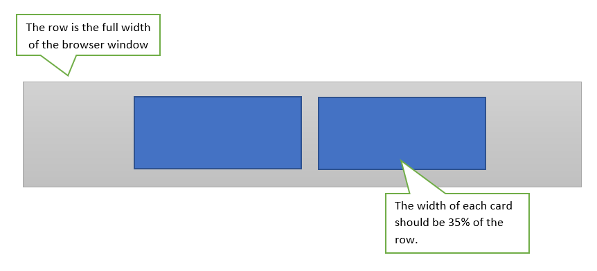
I am working within the W3.CSS framework and trying to center two Cards as seen in the following image.

enter image description here

When the viewport is large or medium sized, I would like the cards to sit adjacent to one another. On small viewports, I would like for them to stack one on top of the other. Anyway, try as I might, I just cannot achieve this layout. I am either able to get the cards to sit adjacent to one another, but they will not center within the row, or I get them to be centered, but they stack on top of each other regardless of the size of the viewport.

Here is some sample code as a starting point.

 <div class="w3-row w3-padding w3-border w3-gray" style="margin:auto">
    <div class="w3-card" style="width:35%;">
        <p>w3-card</p>
    </div>

    <div class="w3-card" style="width:35%;">
        <p>w3-card</p>
    </div>
</div>

I have tried so many different approaches to achieve the desired structure using Grid, Layout and Display controls, but NOTHING has worked.

Thanks in advance for tips or a solution.

Marconi
  • 33
  • 1
  • 7

2 Answers2

1

Here's a pretty basic way of doing it by setting them to inline-block and also setting them to have a min-width in px so they will truncate down when the screen gets small. Here's the jsfiddle to play with: https://jsfiddle.net/trw530q1/

.w3-card {
  display: inline-block;
  background-color: blue;
  min-width: 200px;
}

.w3-gray {
  text-align: center;
}
<div class="w3-row w3-padding w3-border w3-gray" style="margin:auto">
    <div class="w3-card" style="width:35%;">
        <p>w3-card</p>
    </div>

    <div class="w3-card" style="width:35%;">
        <p>w3-card</p>
    </div>
</div>
John
  • 5,132
  • 1
  • 6
  • 17
  • I added a bit of bottom margin to the cards so that they have a little space between them when stacked, but your solution was simple and elegant. Thank you. – Marconi May 24 '20 at 14:10
  • No problem. Glad to have helped. – John May 24 '20 at 16:13
1

Try this:

<div class="w3-padding-large w3-border w3-gray">
<div class="w3-cell-row w3-content" style="width:70.5%">
    <div class="w3-cell w3-mobile w3-container w3-card w3-blue">
        <p>w3-card</p>
    </div>
    <div class="w3-cell w3-mobile" style="padding:0.1em"></div>
    <div class="w3-cell w3-mobile w3-container w3-card w3-blue">
        <p>w3-card</p>
    </div>
</div>    
</div>

(Note:The cell in the middle is just for "esthetics". The value of 70.5 is arbitrary because is including this extra cell.)

Dharman
  • 30,962
  • 25
  • 85
  • 135
L. Alejandro M.
  • 619
  • 6
  • 14