2

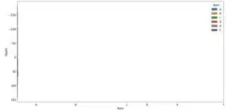
I am attempting to build a violin plot to illustrate depth on the y-axis and a distance away from a known point on the x-axis. I am able to get the x-axis labels to distribute appropriately spaced on the x-axis based on the variable distances but i am unable to get the violin plots to align. They plots appear to be shifted to the y-axis. Any help would be appreciated. My code is below:

import matplotlib.pyplot as plt
import numpy as np
import pandas as pd
import seaborn as sns

path = 'O:\info1.csv'
df = pd.read_csv(path)
item = ['a', 'b', 'c', 'd', 'e', 'f']
dist = [450, 1400, 2620, 3100, 3830, 4940]

plt.rcParams.update({'font.size': 15})
fig, axes1 = plt.subplots(figsize=(20,10))

axes1 = sns.violinplot(x='item', y='surface', data=df, hue = 'item', order = (item))

axes1.invert_yaxis()
axes1.set_xlabel('Item')
axes1.set_ylabel('Depth')
axes1.set_xticks(dist)
plt.xticks(rotation=20)

plt.show()

violin plot

Example dataset:

enter image description here

StupidWolf
  • 45,075
  • 17
  • 40
  • 72
phil
  • 23
  • 1
  • 4
  • 2
    What's in `df`? Can you dump some sample data so we can determine what you expect this code to do? – groundlar May 21 '20 at 23:19
  • You write *"to illustrate a distance away from a known point on the x-axis"*, but you call `sns.violinplot(x='item', ...`? If the `'item'` column contains six different distances, these might me the distances you see on the x-axis. – JohanC May 22 '20 at 09:58
  • I have included an example dataset. The item labels (a list of samples) are appropriately spaced on the x-axis by their defined 'dist'. But i can't seem to get the violin plots to shift from the y-axis to be spaced over the labels on the x-axis. I am sure my mistake is rather trivial. I am new to coding in general, and built the code above off several different examples I found online. I apologize in advance if some of the syntax doesn't make sense or is redundant. Your comments are appreciated. – phil May 22 '20 at 14:58

2 Answers2

2

You cannot use seaborn violin plot, because from the vignette:

This function always treats one of the variables as categorical and draws data at ordinal positions (0, 1, … n) on the relevant axis, even when the data has a numeric or date type.

So if you draw it directly with seaborn, it is categorical:

sns.violinplot(x='dist', y='surface', data=df, hue = 'item',dodge=False,cut=0)

enter image description here

To place the boxplot according, you need to use matplotlib, first we get the data out in the format required and define a color palette:

surface_values = list([np.array(value) for name,value in df.groupby('item')['surface']])
dist_values = df.groupby('item')['dist'].agg("mean")
pal = ["crimson","darkblue","rebeccapurple"]

You need to set the width, provide the distance, and for the inner "box", we modify the code from here:

fig, ax = plt.subplots(1, 1,figsize=(8,4))

parts = ax.violinplot(surface_values,widths=200,positions=dist_values,
              showmeans=False, showmedians=False,showextrema=False)

for i,pc in enumerate(parts['bodies']):
    pc.set_facecolor(pal[i])
    pc.set_edgecolor('black')
    pc.set_alpha(1)

quartile1, medians, quartile3 = np.percentile(surface_values, [25, 50, 75], axis=1)
whiskers = np.array([
    adjacent_values(sorted_array, q1, q3)
    for sorted_array, q1, q3 in zip(surface_values, quartile1, quartile3)])
whiskersMin, whiskersMax = whiskers[:, 0], whiskers[:, 1]

inds = dist_values
ax.scatter(inds, medians, marker='o', color='white', s=30, zorder=3)
ax.vlines(inds, quartile1, quartile3, color='k', linestyle='-', lw=5)
ax.vlines(inds, whiskersMin, whiskersMax, color='k', linestyle='-', lw=1)

enter image description here

If you don't need the inner box, you can just call plt.violin ...

StupidWolf
  • 45,075
  • 17
  • 40
  • 72
0

thanks for including a bit of data. To change your plot, the item and dist variables in your code need to be adjusted, and remove the item = [a,b...] and dist = [] arrays in your code. The ticks on the x-axis using the axes1.set_xticks needs a bit of tweaking to get what you're looking for there.

Example 1: removed the two arrays that were creating the plot you were seeing before; violinplot function unchanged.

# item = ['a', 'b', 'c', 'd', 'e', 'f'] * Removed
# dist = [450, 1400, 2620, 3100, 3830, 4940] * Removed

plt.rcParams.update({'font.size': 15})
fig, axes1 = plt.subplots(figsize=(20,10))

axes1 = sb.violinplot(x='item', y='surface', data=df, hue = 'item', inner = 'box')

axes1.invert_yaxis()
axes1.set_xlabel('Item')
axes1.set_ylabel('Depth')
#axes1.set_xticks(dist) * Removed
plt.xticks(rotation=20)

plt.show()

removed item and dist arrays for plot

Inside each curve, there is a black shape with a white dot inside. This is the miniature box plot mentioned above. If you'd like to remove the box plot, you can set the inner = None parameter in the violinplot call to simplify the look of the final visualization.

Example 2: put dist on your x axis in place of the xticks.

plt.rcParams.update({'font.size': 15})
plt.subplots(figsize=(20,10))
# Put 'dist' as your x input, keep your categorical variable (hue) equal to 'item'
axes1 = sb.violinplot(data = df, x = 'dist', y = 'surface', hue = 'item', inner = 'box');
axes1.invert_yaxis()
axes1.set_xlabel('Item')
axes1.set_ylabel('Depth');

distance on x axis

I'm not confident the items and the distances you are working with have a relationship you want to show on the x-axis, or if you just want to use those integers as your tick marks for that axis. If there is an important relationship between the item and the dist, you could use a dictionary new_dict = {450: 'a', 1400: 'b', 2620: 'c' ...

Hope you find this helpful.

Community
  • 1
  • 1
jwho
  • 192
  • 6