0

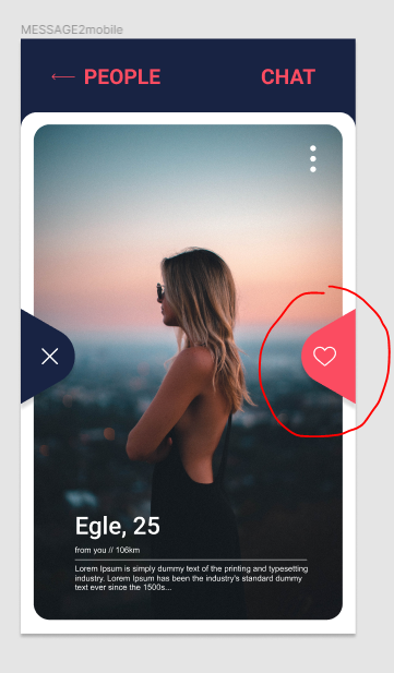
Hi guys so i try to add two icons of hearts like in this picture: enter image description here

I tried to make these components:

<View style={styles.buttonContainer}>
        <View style={styles.xButton} />
        <View style={styles.heartButton} />
      </View>

my styles:

const styles = StyleSheet.create({
  heartButton: {
    backgroundColor: '#FB4C61',
    height: 80,
    width: 60,
    borderTopLeftRadius: 100,
    borderBottomLeftRadius: 100,
    // borderRadius: 10,
    // borderWidth: 1,
    // borderColor: '#fff',
  },
  xButton: {
    backgroundColor: '#182343',
    height: 80,
    width: 60,
    alignSelf: 'center',
    borderTopRightRadius: 100,
    borderBottomRightRadius: 100,
  },
  buttonContainer: {
    flex: 1,
    flexDirection: 'row',
    justifyContent: 'space-between',
    zIndex: 999,
    alignItems: 'center',
    top: 200,
  },

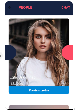
The result i get in my phone: enter image description here

I am using figma for design, maybe I should export all item and add it like image?

Emilis
  • 152
  • 1
  • 4
  • 21

2 Answers2

1

I think something like this would give you your shape (expo snack)

in render :

  <View style={styles.topFlag} />
  <View style={styles.centerFlag} />
  <View style={styles.bottomFlag} />

in styles

  centerFlag: {
    height: 20, 
    width: 60, 
    backgroundColor: "green",
    borderLeftColor: "green", 
    borderTopRightRadius: 9,
    borderBottomRightRadius: 10,
  },
  bottomFlag: {
    height: 30, 
    width: 0, 
    borderBottomColor: "transparent",
    borderLeftColor: "green", 
    borderLeftWidth: 52,
    borderBottomWidth: 30,
  },
  topFlag: {
    height: 30, 
    width: 0, 
    borderTopColor: "transparent",
    borderLeftWidth: 52,
    borderLeftColor: "green", 
    borderTopWidth: 30,
  }

you can get inspiration in this tuto

romchambe
  • 61
  • 2
1

You can create a view with a certain borderRadius and transform it over an angle like below.

import React, {Component} from 'react';
import {View, StyleSheet} from 'react-native';

const styles = StyleSheet.create({
  my_component: {
    width: 110,
    height: 110,
    position: 'absolute',
    backgroundColor: 'black',
    borderStyle: 'solid',
    borderLeftColor: 'transparent',
    borderTopStartRadius: 45,
    borderRightColor: 'transparent',
    borderBottomColor: 'red',
    top: '40%',
    transform: [{rotate: '135deg'}],
  },
  leftComponent: {
    transform: [{rotate: '135deg'}],
    left: -55,
  },
  rightComponent: {
    transform: [{rotate: '315deg'}],
    right: -55,
  },
});

class Page extends Component {
  render() {
    return (
      <View style={{flex: 1, backgroundColor: '#ffffff'}}>
        <View style={[styles.my_component, styles.leftComponent]} />
        <View style={[styles.my_component, styles.rightComponent]} />
      </View>
    );
  }
}

export default Page;

The position is set to absolute. The result achieved looks like: screenshot.jpg

I haven't added any Icons, but icons must also be positioned using position: 'absolute' and move them accordingly.

I believe the result is the closest to what you were trying to achieve.