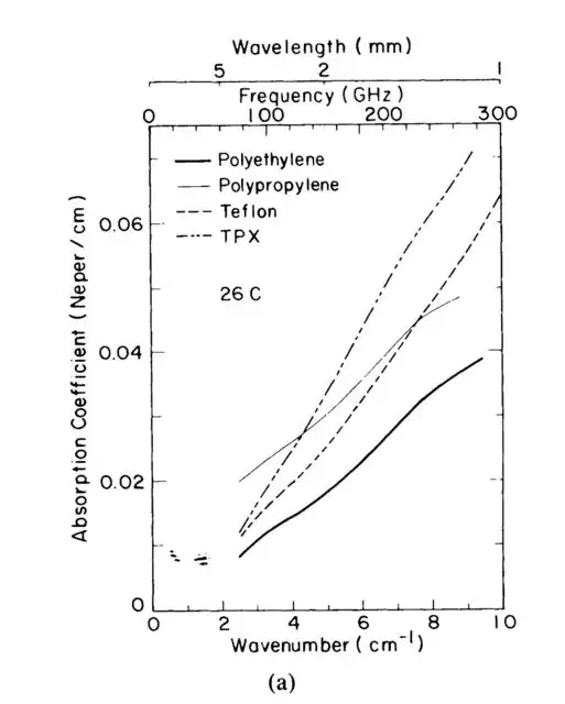
I'm trying to bring together to different plot settings in matplotlib. I found nice examples for each of them in the matplotlib example gallery/documentation and stack but I couldn't find anything on my specific problem.
So what I know so far is, how to add one or more axes with offset y-axis for plotting different data with respect to the same x-axis, by using ax.twinx(). The third y-axis is called parasite axis in the example Parasite axis demo. However, if you want to add an additional axis which is just a scaled version of the existing one, you can use ax.secondary_yaxis(), as shown in the Secondary axis demo. There is no additional data to be plotted.
What I could not achieve so far is a secondary y-axis which is offset from the original one. This can be very helpful to make plots more readable across scientific communities. For instance, while some scientists use frequency as reference for the electromagnetic spectrum, others use the wavelength or the wavenumber. Afsar [1] used a very convenient axis labeling which includes all the three variables in the same plot:
I would like to the something similar, just on the y-axis instead of the x-axis. Is there a way to offset the secondary axis from the primary axis? I tried a few parameters but couldn't figure it out.
Thank you for any help!
[1] Afsar, Mohammed Nurul. “Precision Millimeter-Wave Measurements of Complex Refractive Index, Complex Dielectric Permittivity, and Loss Tangent of Common Polymers.” IEEE Transactions on Instrumentation and Measurement IM–36, no. 2 (June 1987): 530–36. https://doi.org/10.1109/TIM.1987.6312733.
[1]:


