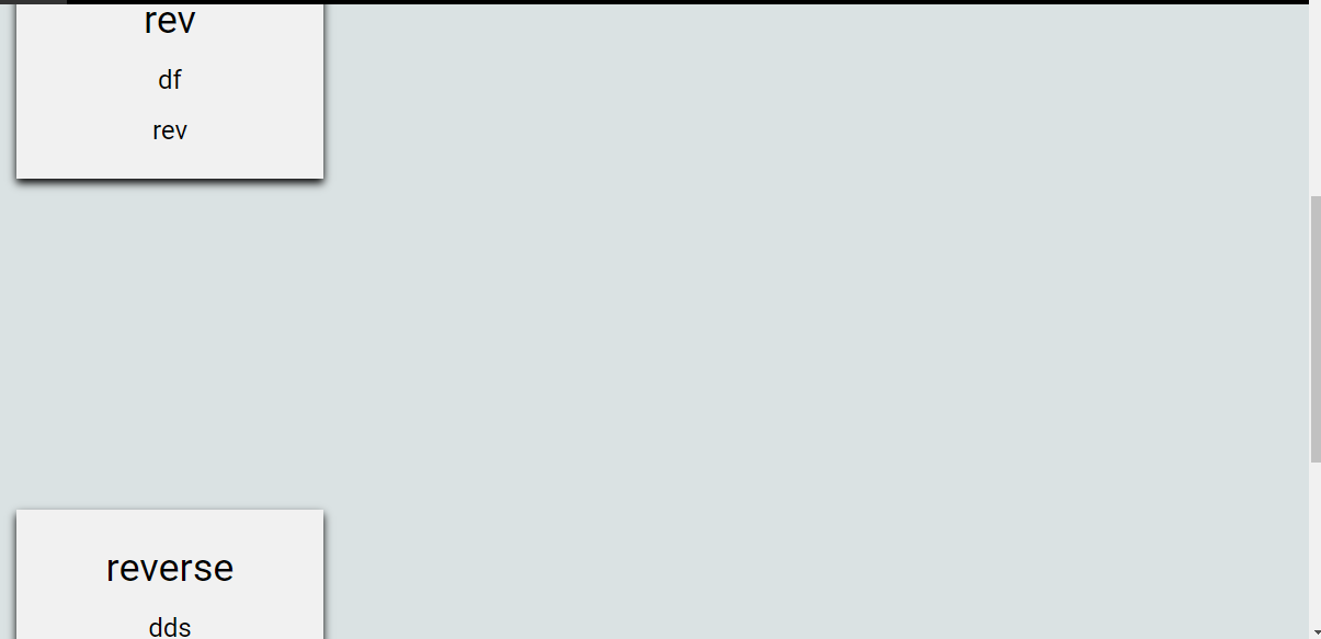
i have a single div template and i have generated multiple divs with dynamic content through PHP. now the issue is my divs are creating at irregular positions(check the image attached below) and what i want is. "I want exactly four divs of equal size in each row and each div have to be side by side and a small gap needs to be maintained between each div".
here is my div.
<div class="row" id="except">
  <div class="column">
    <div class="card">
      <h1><?php echo"$value"; ?></h1>
      <h3><?php echo"$description";?></h3>
      <h3><?php echo"$index";?></h3>
    </div>
  </div>
</div>
here is my CSS for each div.
<style>
    #except{
      width:1200px;
      height:500px;
      margin-left:160px;
    }
* {
  box-sizing: border-box;
}

body {
  font-family: Arial, Helvetica, sans-serif;
}

/* Float four columns side by side */
.column {
  float: left;
  width: 25%;
  padding: 0 10px;
}

/* Remove extra left and right margins, due to padding */
.row {margin: 0 -5px;}

/* Clear floats after the columns */
.row:after {
  content: "";
  display: table;
  clear: both;
}

/* Responsive columns */
@media screen and (max-width: 600px) {
  .column {
    width: 100%;
    display: block;
    margin-bottom: 20px;
  }
}

/* Style the counter cards */
.card {
  box-shadow: 0 4px 8px 0 rgba(0, 0, 0, 1);
  padding: 16px;
  text-align: center;
  background-color: #f1f1f1;
  transition: width 2s,height 4s;
  transition-timing-function: ease-in-out;
}
    .card:hover{
      background-color: lightgreen;
      transition-timing-function: ease-in-out;
      width: 300px;
      height: 300px;
    }
</style>