3

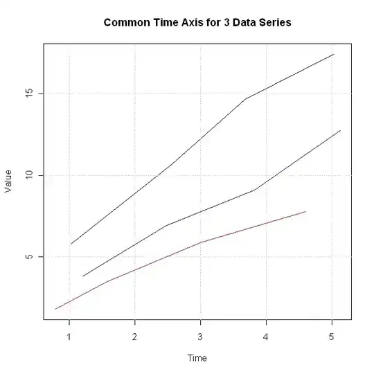
I have three timestamped measurement series, taken over the same interval, but with different actual timestamps. I'd like to show these three trajectories in a combined plot, but because the x-axis (timestamps) is different in each case, I'm having some trouble. Is there a way to do this without picking an x-axis to use and interpolating the y-values for the other two measurement series? I'm fairly new to R, but I feel like there's something obvious I'm overlooking.

For example:

Series 1

Time    Value
1.023   5.786
2.564   10.675
3.678   14.678
5.023   17.456

Series 2

0.787   1.765
1.567   3.456
3.011   5.879
4.598   7.768

Series 3

1.208   3.780
2.478   6.890
3.823   9.091
5.125   12.769
Roman Luštrik
  • 69,533
  • 24
  • 154
  • 197
William Gunn
  • 2,925
  • 8
  • 26
  • 22
  • 1
    Can you add some sample data (real or fictional) so that we will know what type of time/date data you have? – kmm May 24 '11 at 19:38
  • That's better, you can make our lives easier if you instead use `dput(data)`, where data is wherever you got series1, series2, and series3 – Rguy May 24 '11 at 19:50
  • Rguy, could you expand on that? How can my question be improved by dput? – William Gunn May 24 '11 at 20:06
  • 1
    @william - dput will let others copy and paste the exact structure of your data into our R sessions. This is often the easiest and most efficient way to communicate data. It ensures that the type of data is consistent with your R session, and eliminates almost all possibilities of differences between your R session and others. – Chase May 24 '11 at 20:26
  • OK, that makes sense. So for long datasets, you'd just show the first couple rows? – William Gunn May 24 '11 at 20:32
  • @William - exactly. Something like `dput(head(dat))` often does the trick. Or sample from your data to capture a random effect that is important, etc. – Chase May 24 '11 at 20:36

4 Answers4

5

With base graphics, you can use a combination of plot and points or lines:

dat1 <- data.frame(Time = c(1.023, 2.564, 3.678, 5.023), Value = c(5.786, 10.675, 14.678, 17.456))
dat2 <- data.frame(Time = c(0.787, 1.567, 3.011, 4.598), Value = c(1.765, 3.456, 5.879, 7.768))
dat3 <- data.frame(Time = c(1.208, 2.478, 3.823, 5.125), Value = c(3.780, 6.890, 9.091, 12.769))

with(dat1, plot(Time, Value, xlim = c(0,6), ylim = c(0,20)))
with(dat2, points(Time, Value, col = "red"))
with(dat3, points(Time, Value, col = "green"))

Take a look at ?legend to add a legend. Or, learn ggplot2 and let it handle that part of it for you:

library(ggplot2)
library(reshape)
plotdata <- melt(list(dat1 = dat1, dat2 = dat2, dat3 = dat3), "Time")

qplot(Time, value, data = plotdata, colour = L1)
Chase
  • 67,710
  • 18
  • 144
  • 161
  • you are missing library(reshape) from which the function melt comes. – PatrickT Mar 18 '13 at 08:23
  • Thanks @patrickT, fixed. This answer was from the days when reshape was loaded when calling ggplot2...that no longer happens. – Chase Mar 18 '13 at 13:05
3

Try this:

t1 <- "Time Value
1.023   5.786
2.564   10.675
3.678   14.678
5.023   17.456"

t2 <- "Time Value
0.787   1.765
1.567   3.456
3.011   5.879
4.598   7.768"

t3 <- "Time Value
1.208   3.780
2.478   6.890
3.823   9.091
5.125   12.769"

tex1 <- read.table(textConnection(t1), header = TRUE)
tex2 <- read.table(textConnection(t2), header = TRUE)
tex3 <- read.table(textConnection(t3), header = TRUE)

plot(tex1, type="l", xlim=range(tex1$Time, tex2$Time, tex3$Time), ylim=range(tex1$Value, tex2$Value, tex3$Value), main="Common Time Axis for 3 Data Series", col="black")
grid()
lines(tex2, col="red")
lines(tex3, col="blue")

enter image description here

bill_080
  • 4,692
  • 1
  • 23
  • 30
1

Without any further information, it seems you're going to have to use a combination of: points and xlim.
Plot a single combination of the points (or lines) using plot, passing the xlim argument so that all of your time inputs could fit on the plot.
Then, use points or lines to add the other data to the plot, and maybe pass a color parameter to these functions as well to distinguish the outputs.
We can provide more details if you include a minimal reproducible example!

Rguy
  • 1,622
  • 1
  • 15
  • 20
0

Subtract the minimum value for time in each series. Determine maximum of the three results as your xlim[2]. Plot using matplot with label suppression, and then add your labels= and at= with axis().

IRTFM
  • 258,963
  • 21
  • 364
  • 487