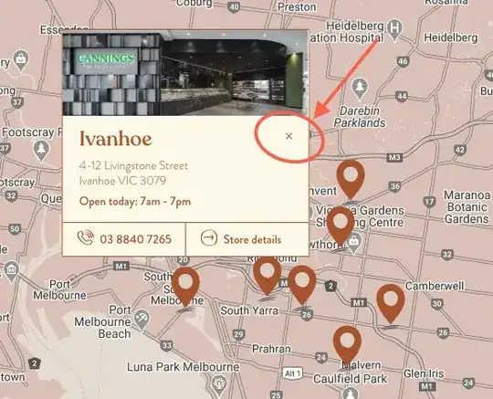
I'm working on a react js project where I'm using the mdbootstrap, I'm trying to build a component similar to this 
the first picture is for desktop and another is for mobile users
So, I was trying to achieve something similar and I started playing with bootstrap classes but couldn't achieve this in my react project. But to my surprise in my project, the columns are not taking full width. Why is it happening and what can I do?
Here's it working fine in normal HTML:
<!DOCTYPE html>
<html lang="en">

<head>
  <meta charset="UTF-8" />
  <!-- Font Awesome -->
  <link rel="stylesheet" href="https://use.fontawesome.com/releases/v5.8.2/css/all.css">
  <!-- Google Fonts -->
  <link rel="stylesheet" href="https://fonts.googleapis.com/css?family=Roboto:300,400,500,700&display=swap">
  <!-- Bootstrap core CSS -->
  <link href="https://cdnjs.cloudflare.com/ajax/libs/twitter-bootstrap/4.4.1/css/bootstrap.min.css" rel="stylesheet">
  <!-- Material Design Bootstrap -->
  <link href="https://cdnjs.cloudflare.com/ajax/libs/mdbootstrap/4.15.0/css/mdb.min.css" rel="stylesheet">
  <meta name="viewport" content="width=device-width, initial-scale=1.0" />
  <title>Document</title>
</head>

<body>
  <div class="container-fluid">
    <div class="row">
      <div class="col-sm-8" style="background-color: red;">
        One of two columns
      </div>
      <div class="col-sm-4" style="background-color: yellow;">
        One of two columns
      </div>
    </div>
  </div>
</body>

</html>
Check this code on JsFiddle.
Here's the link for my react js project and the component is profile.js you can check it through navbar: https://codesandbox.io/s/dawn-flower-iqcuz
Here's what I'm getting
This is what I want


