Based on my previous question on Vue-Bootstrap panel I started using the following code to create a panel:
<b-card no-body class="mb-1">
    <b-card-header header-tag="header" class="p-1" role="tab">
        <b-button block disabled href="#" v-b-toggle.accordion-1 variant="info">Search:</b-button>
    </b-card-header>
    <b-collapse id="accordion-1" visible accordion="my-accordion" role="tabpanel">
        <b-card-body>
            <search-form :fieldList="fieldList" :customs-max-num="customsMaxNum" :data-types="dataTypes" />
        </b-card-body>
    </b-collapse>
</b-card>
As you can see, I a button as a header. But what If I want to do something more complicated? For example I want to create the following header:

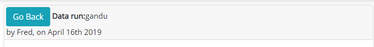
As you can see, this header contains a title and a button. If I do it as I did before, I will have a button and text on a button? Does not feels right. What I currently have:
<b-card no-body class="mb-1">
    <b-card-header header-tag="header" class="p-1" role="tab">
        <div class="title align-left" height="100px">
            <button class="pull-right btn btn-info" @click="goBack()">Go Back</button>
            <strong>Data run:</strong>
            {{ title() }} <br> {{ subtitle() }}
        </div>
    </b-card-header>
    <!-- BODY -->
</b-card>
How it looks like:
How do I create such panel?